study
« Previous Entries Next Entries »Writing
Thursday, April 1st, 2010
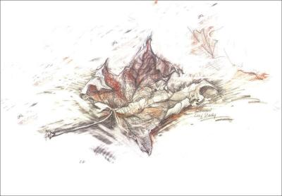
The article on Drawing is finally revised and re-posted…10 days writing and revising. If I could draw about extreme writing I would, because it would certainly be a lot easier! Tomorrow, a treat away from all the computer work: starting a new painting. Today: a leaf study, conte and graphite on paper.
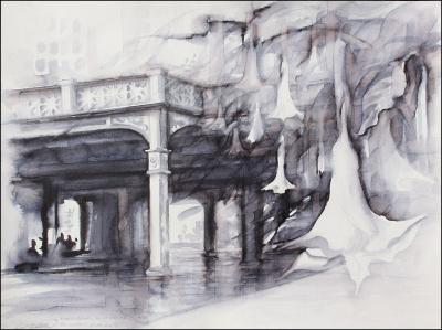
Angel’s Trumpet
Tuesday, November 10th, 2009
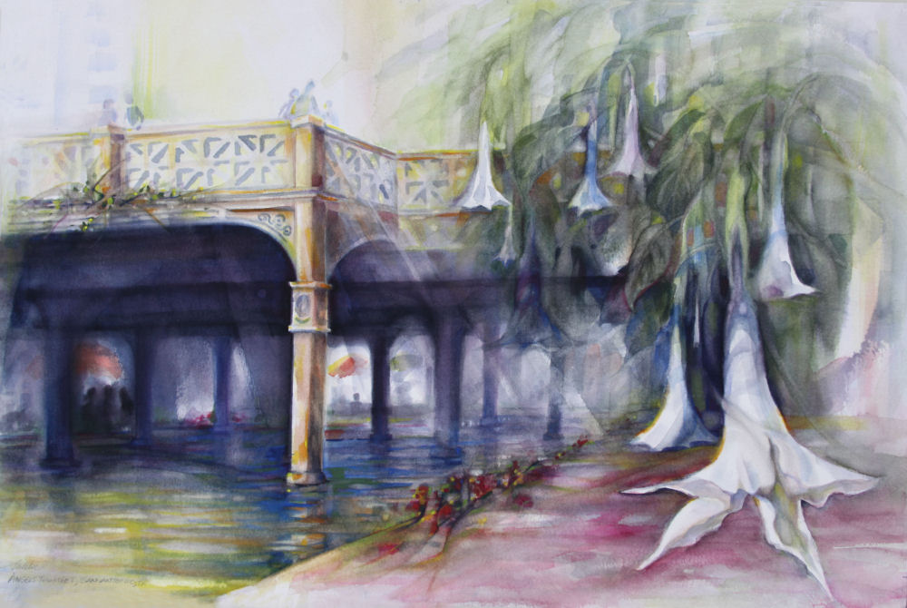
Angel’s Trumpet (Brugmansias) San Antonio Riverwalk, Texas – 14H x 22W inches watercolors on 140 lb. cold pressed premium, white mat
Value study
Thursday, November 5th, 2009
Angel’s Trumpet value study, San Antonio Riverwalk, Texas –12 x 16 inches Tombo pen wash on 140 lb. WC paper.
The Tombo pen is a two-in-one water-soluble marker available in colors as well as black. One tip is medium-fine and the other looks and behaves like a Chinese paintbrush, where thickness of lines can be controlled. What’s more difficult to control is that black once it’s on the page! It’s something to pay attention to when painting the colored version.
Preliminary studies are useful with watercolors because if, in trying to correct and re-work areas, the integrity of the paper is easily lost, especially on inexpensive papers. Still, on a traditional watercolor a lot can be done by adding water to pull out the dark where it’s not wanted, and push out areas of paint with dry brushes. Some places in this study have built-up 3D edges created by the paper bits because I pushed them around so much with a stiff brush to correct things, but traditionally this is not acceptable.
Actually, come to think of it, that might be interesting to deliberately sculpt the paper in strategic areas – like objects in the foreground – by saturating it with too much water, then while painting, brush the resulting paper bits into piles and mold them with a stiff brush. I may try that in the final colored painting of this scene. This proves once more that every single painting is an experiment to find ways to turn disadvantages and limitations into advantage and innovation.
Even though WC and Acrylics are water-friendly and watered-down acrylics is the method I use to start most canvas paintings, I’m noticing a few outstanding differences : 1) an off-balance composition seems to be more noticeable with WC, definitely not as correctable 2) improved attention to drawing, details and ultra-conscious 3) requires pre-planning and foresight to keep the work fresh and clean 4) commands enough confidence to swish the paint on quickly as if it was not planned.
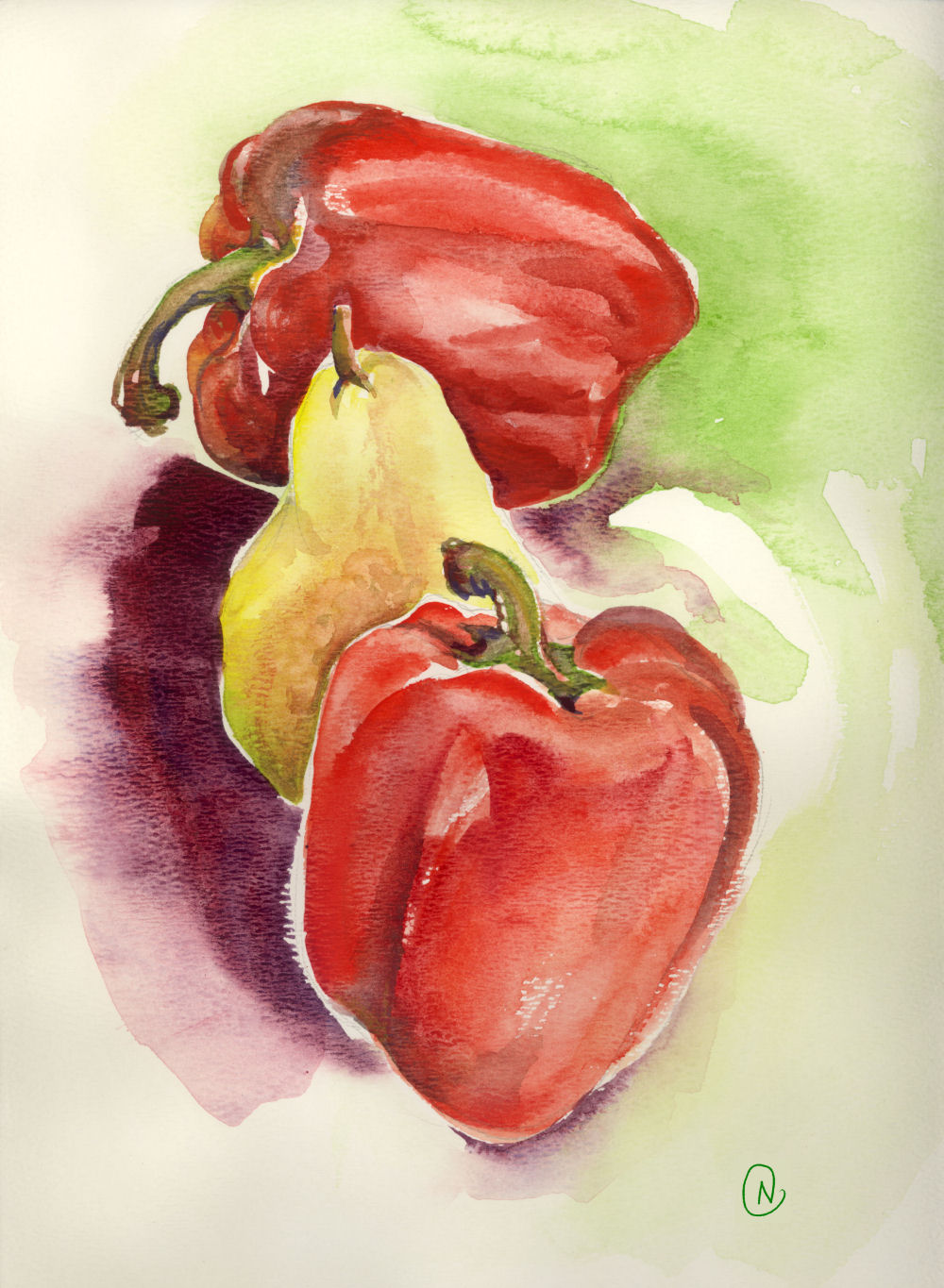
Red peppers and pear study 02
Friday, October 16th, 2009
Red peppers and pear study 02, 14H x 11W inches watercolors on 120 lb premium, white mat
I just started watercolors classes today with Jo Williams in Denton, TX. Watercolors are in a league of their own…that’s what I learned today. Acrylics are my favorite medium because of their versatility, and I always start out covering the canvas using watercolor techniques, but even though both have similar properties at the wateriest level, they are nothing alike. Brushing up on watercolors skills though, will positively add to confidence in using acrylics. I haven’t worked alongside others for a while either, so class critique will be really helpful too.
Myrtle At The Zoo, March 10 – April 2
Wednesday, April 2nd, 2008
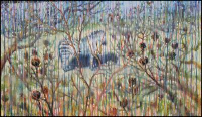
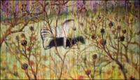
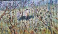
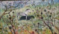
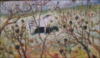
Myrtle at the Zoo, Crepe Myrtle branches and seed-pods, 20H x 34W x 2D inches acrylics on canvas study, sides painted. Posts here go back to the start of work, sharing the process.
I’ve learned a lot and enjoyed playing with different ideas. It’s been interesting teetering back and forth between frustration and fun, but sometimes that’s what painting is all about. There’s been such a tension over this one as with no other painting, where the urge to throw it away is pitted against the determination to see what could happen. I still like a lot of things in it, such as the technique of dripping paint down the front that I’ve tried in previous paintings. Dripping re-energized the painting and me, and took the work in unexpected directions.
April 1st: 1. dripped violet across the top and deep yellow from the bottom. This move brings about a new set of problems that may lead the way to what I’m searching for; could be that recovery is impossible 2. Later notes after one days of work, Apr.1st: I like where the drips made me go…sometimes you’ve gotta take a leap.
March 27th – 30th The zebra is too prominent no matter what I try to blur it into the background, so more branches have been added to the foreground.
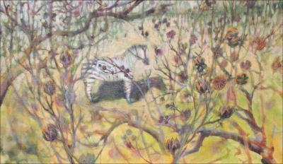
March 20th – 26th: After another few days of remapping, I like the direction it’s taking with the larger Myrtle seed-pods in the foreground…hardly touched the zebra, except before starting today, scrubbed and washed off a lot of the surface and concentrated mainly on re-working the whole composition.
Art in general, no matter what the media, has us confront varying emotions while we work, pleasant and unpleasant. If the piece is taking longer than anticipated, any self-expectations that mount don’t help the progress at all. There are also echos of things other Artists say, like “if it’s taking too long, trash it and start over”. That one always puzzles me – why tell someone to quit? How about searching for all that the work might possibly become? Fear of ruining work that’s already accomplished can hold us back from throwing our whole selves into it, bringing it to a new level.
It seems that so much fuss is made about paintings that are whipped off in a day. While the method of finishing work quickly is great, this is not the ideal for every painter. Most paintings do have a lot of life and zing after only one day of work and sometimes it’s best to leave them that way. Some Art is best left as “pure”, responsive, raw… and some work begs to be analyzed and dissected, perhaps to the death of the piece and having nothing to show for the labor.
Each artist knows if each painting at the end of the day has potential to become something more, and the decision to stay or to search is different with each and every piece. I say don’t give up if a painting takes too long to come to fruition.
March 15th – Freestyle brushstrokes have livened work up a little since the last post. Intentions are for the painting to be more about the Myrtle than the zebra, but the zebra is key to determining the rhythm of the whole composition. The biggest challenge is that the zebra is such a striking subject alone, and competes for importance with the branches. Color is a huge issue also, because the ground is dry and bright during winter, but so is the zebra. This is why I have yellow tones in the ground, and gradually am adding darker values, playing with colors throughout the painting process.
Every aspect is gradually worked through as painting progresses; no definite decisions made until the final day. If/when work finally succeeds, all the stages of color transitions show through in bits and pieces across the canvas, contributing to the final color and depth impressions. It’s really the process of change in a painting that’s most enjoyable and educational. Every stage is photographed or scanned, and the process can be evaluated after it’s finished.
– am finding it hard to maintain a balance of weight on the right and left sides beside such strong tones in that fur…I may add is a couple of unusually large detailed seed-pods in the foreground to take the eyes’ attention away from the zebra at first glance. I keep playing with colors, patterns, brushstrokes, scratching/removal of paint and anything I can think, still aware that the painting needs more depth.
March 10th – striving for an accurate portrayal of Crepe Myrtle branches in winter, and except for a few detailed seed-pods in the foreground, an overall abstract representation more than realism. The zebra is purposely off-center in an attempt to allow more space for the main subject. Establishing the composition is always priority over accurate colors at first, which of course are to be considered but like other details are left until the final day of completion.
Mockingbird ritual
Thursday, March 6th, 2008
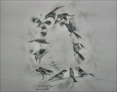
Mockingbird mating flight ritual – 10 x 10 inches study in graphite, eraser, paper
Last night it was especially noticeable that the Mockingbirds have started their mating season. Pronouncing himself at the highest peak on a rooftop, the male mocks other birds’ calls, repeating each 3-4 times before changing to another call. Then in a ritual flight dance he flies up a short distance and does graceful flip in the air, flashing the white wing stripes, back to the perch and repeats the pattern over and over.
After listening to them quite a bit, there are some that have a larger repertoire of calls and a louder, determined, clearer song…I’m guessing that those are the most mature and attractive.
Takkakaw Falls
Saturday, January 12th, 2008
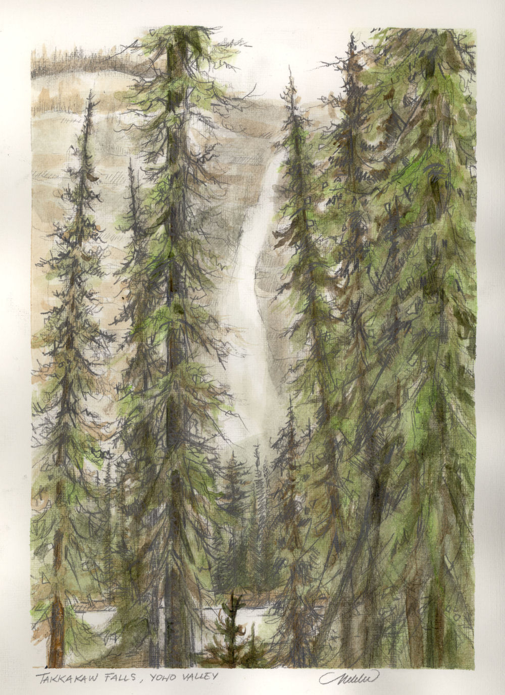
Takkakaw Falls, Yoho Valley, B.C. 830 feet high, said to be the most impressive waterfalls in North America next to Niagara. 12H x 9W inches graphite, watercolors, based on antique Vandyck photos of the Canadian Rockies. Study only, not available
Mt. Assiniboine
Friday, January 11th, 2008
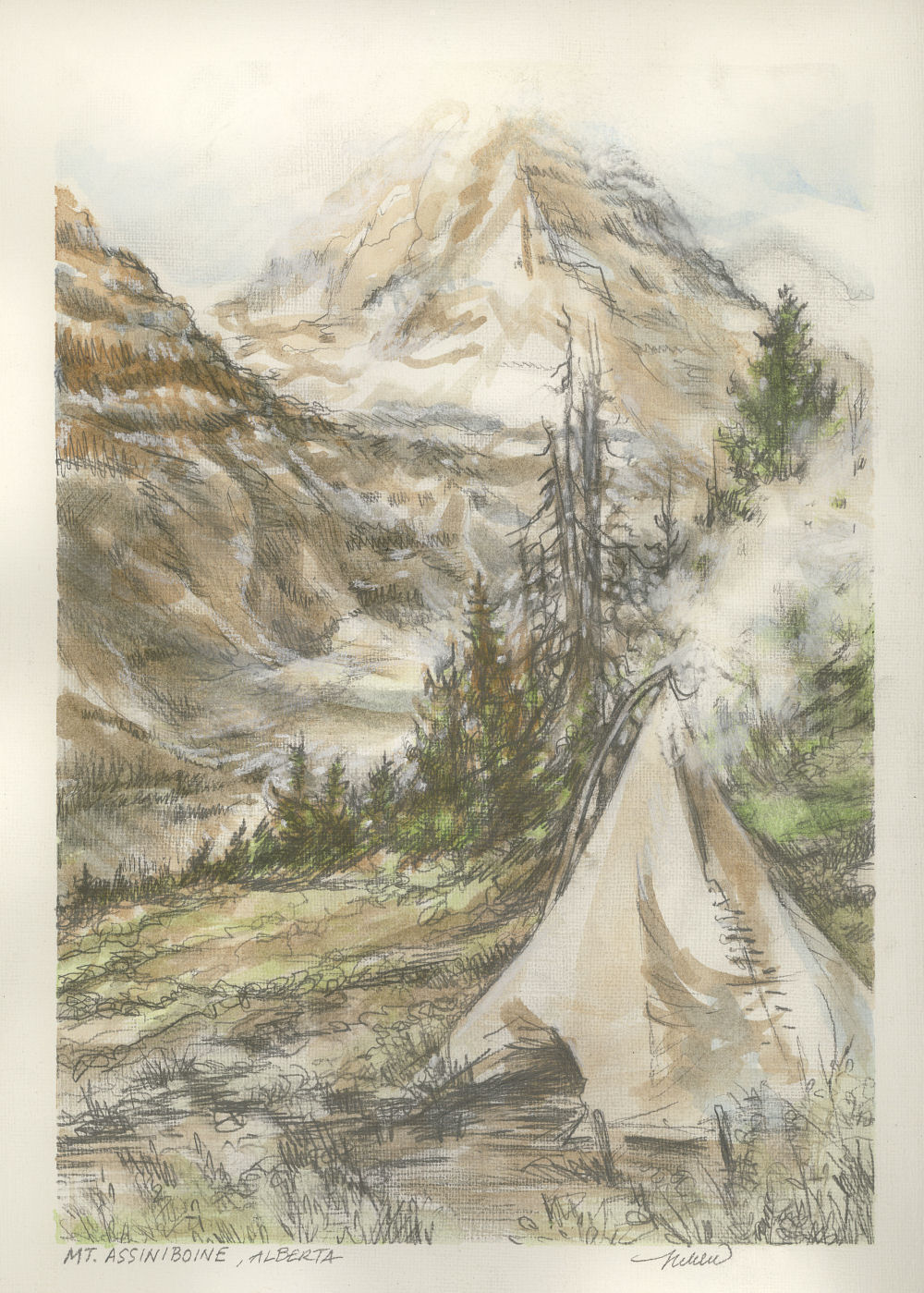
Mt. Assiniboine, about forty miles southwest of Banff, Alberta. 12H x 9W inch watercolor and graphite, study only, not available.
I inherited some charming antique books of hand-colored “Vandyck Photogravures” of Canadian Rocky Mountains scenery as it was at the turn of the twentieth century. The monotone sepia and few other pale colors add such a warmth to the already beautiful scenery in the 1910 photographs, and since I haven’t tried watercolors for years, I thought they would make perfect studies.
Dancing With Trees 02
Tuesday, October 9th, 2007
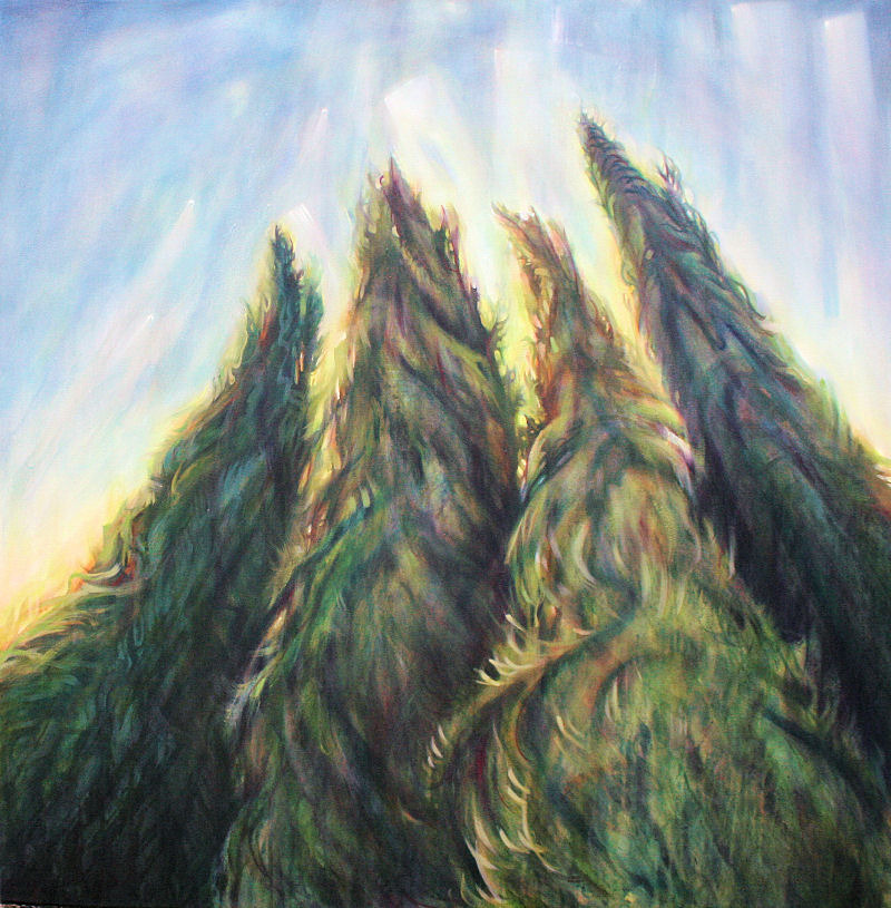
Dancing With Trees 02, 48H x 48W x 1D inches acrylics, matt and semi-gloss glaze medium, and semi-gloss varnish on canvas, scene continues onto trim frame. Detail images below.
Layers of glaze washes used in final stages: Hansa yellow light, Phthalo blue, Phthalo green, Permanent green, Thio violet, Mars black, Cadmium red light, Dioxazine violet.
This piece is an example of work that does not reflect the original vision but is turning into something much more interesting. To help enhance the character of cedar branches I’ve dripped water, paint, glazes, and varnish across patches of color, splattered it on with a brush and also painted it turned upside down. This left sheen and textures not captured in photos; best seen in person.
Dancing With Trees 02, started August 30th – several progression details posted on different dates are combined in this post. The oil pastel with the same name, first version, posted in March 2007, inspired the painting.
 |
 |
 |
|||
 |
 |
 |
A tale of two drawings
Friday, September 21st, 2007
Northern Delights 01, Banff, Alberta, Canada, 14H x 11W graphite, water-wash pencil, oil pastel, colored pencils on paper. 3-inch-wide white double mat and 26H x 22W inch white custom-built white wood frame with crackle finish.
and
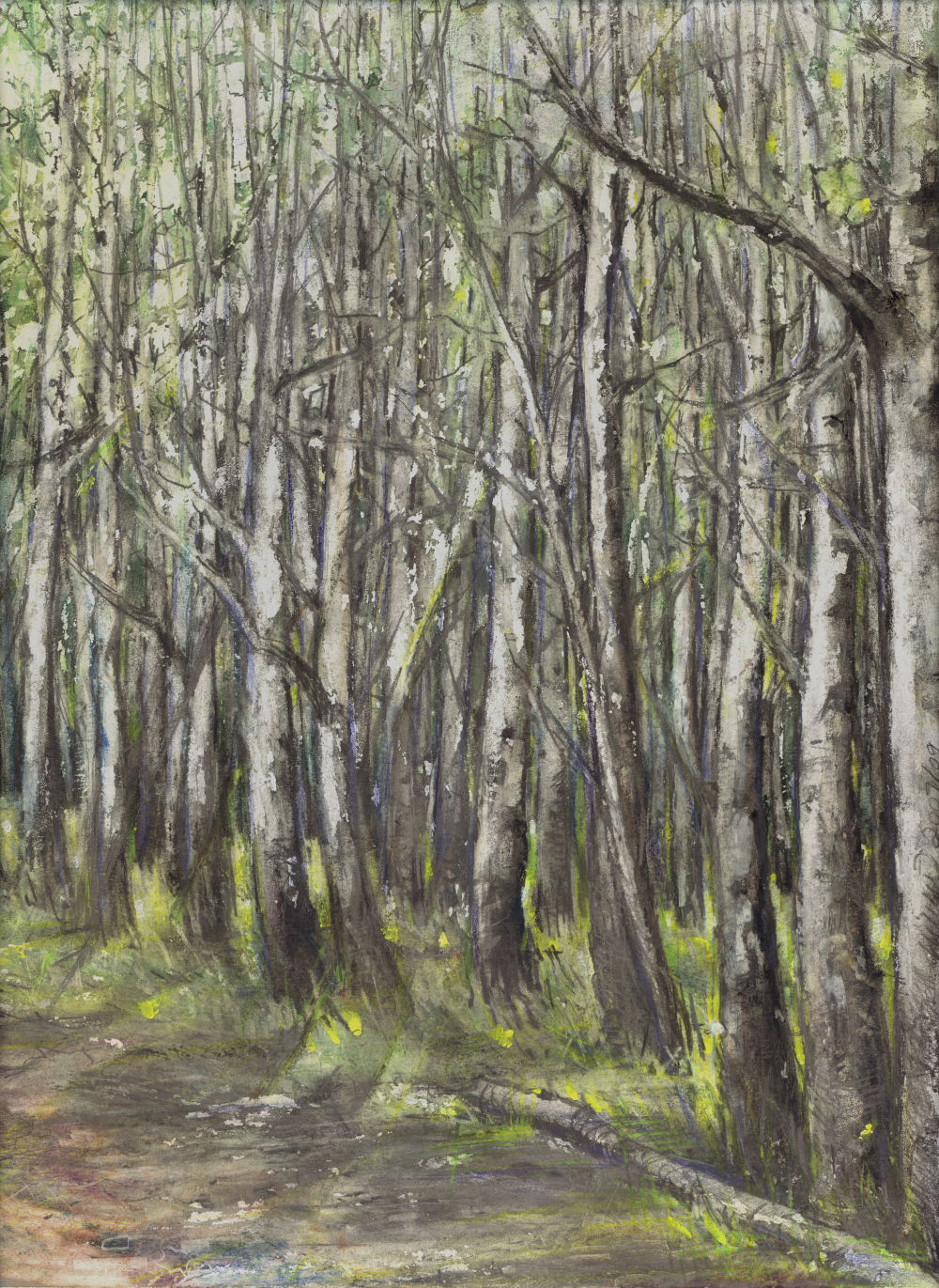
Redbuds 03, Eastern Redbuds blooming on a foggy Spring morning in Coppell, Texas. 14H x 11W oil pastels, graphite, water-wash graphite, colored pencils, eraser on paper
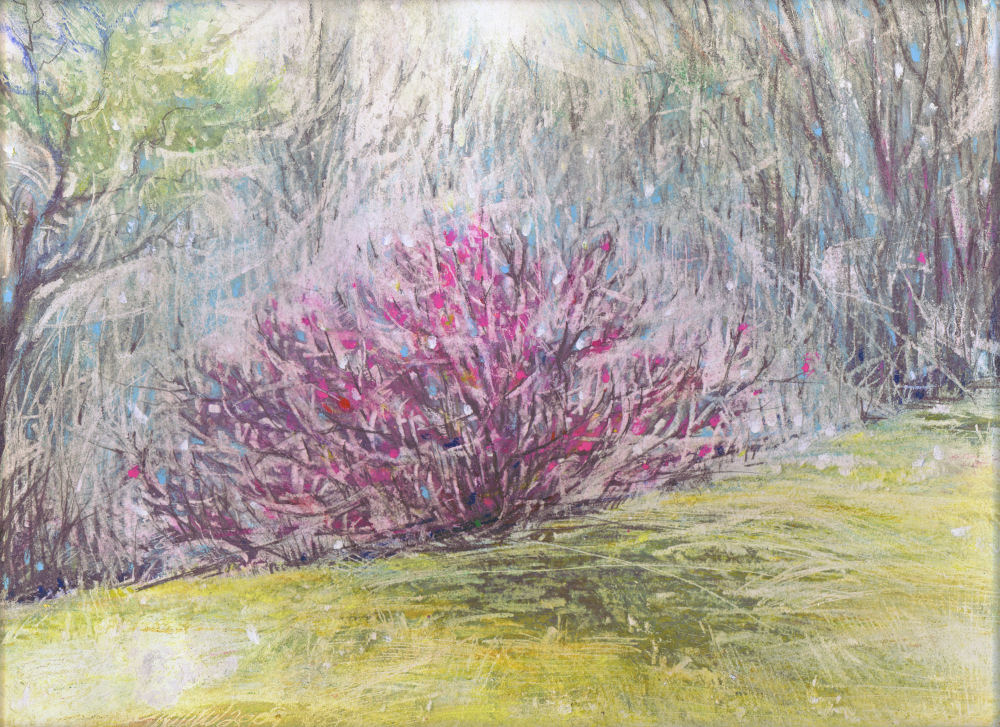 Browsing for pieces to enter in a juried exhibition, I came across two drawings started in March that have a lot in common. Both scenes are low-light situations that were achieved by lots and lots of layering, scraping, redrawing, and using the eraser over pastels for blending as well as erasing. Both are experimental re: oil pastels vs. paintable water-wash graphite pencil.


