
drawings
« Previous Entries Next Entries »Evelyn
Saturday, May 26th, 2007

Evelyn, 11 x 14 inches graphite, eraser on paper. When drawing I use the eraser as much as the pencil. Taking advantage of smudges that build up gradually is a good way to keep adjusting the placement of things and clarify details. This is especially effective with portraits.
Lucas at the Museum
Wednesday, May 23rd, 2007

Lucas at the Museum, 11 x 14 graphite on paper. Original NA. Prints available. 22 x 26″ white mat and frame.
Post-dated note: Lucas at the Museum is part of the Growing Up and Looking Back Exhibition: Reflecting on Childhood, Parenting, and Home in Swainsboro, GA October 13 – November 3, 2007
Aspen, Banff National Park
Thursday, March 22nd, 2007

“Northern Delights 01, Aspen at a protected Bison reserve, Banff National Park, Alberta Canada – 14H x 11W inches oil pastels and water-wash pencils on paper, white double mat, 22H x 26W inches white frame with white crackle finish
Scared of Color
Saturday, January 20th, 2007

Have you ever painted the walls in your house, difficult it is to choose a shade of white, or come home with a can of paint based on a one by one inch splotch of color, only to find it’s totally different. Why don’t people have red living rooms, purple kitchens and bright green foyers? I still have reservations about using pure color on my canvases. Color makes you feel a certain way…colors or lack of them in our homes reflect the way we feel or want to feel.. Likewise, your Artwork; color is the most difficult thing to master .
Scared of Color was drawn with my new computer pen, using the Paint Shop Pro program. It’s like learning to draw all over again.
Jabiru
Friday, September 1st, 2006

Jabiru at the Dallas World Aquarium, 24H x 18W inches graphite on paper
Post-dated note: Accepted in the J. Mane Gallery’s Fins, Feathers and Fur 2020 exhibition, unfortunately no longer shown in the gallery archives in 2022.
“Drawings have a job to do: to provide viewers with more than just a pretty picture. There are tones implied through those tones!”
Jabiru are large South American prehistoric-looking birds standing 4-5 ft. high. Reference photos for ‘Jabiru’ were taken at the Dallas World Aquarium, where I’ve spent many visits watching a pair of them interact. Fortunately, I can usually study them in silence, because everyone else’s attention is on the flashy coral-colored flamingos just down the aisle.
Before starting I envisioned a drawing based on Japanese principles of using fewer lines and shading, with empty spaces considered as much a part of the drawing as every mark.
This is not the prettiest subject, precisely one of the reasons I chose to keep the drawing soft. By purposely compromising the values and using a lighter touch, my hope was that the viewer’s response might be pleasant before thinking “ugly bird”. To explain further, the Jabiru’s feathers are pure white and its head including beak are very dark grey, almost black. I was stubborn about the style staying gentle and simple, having negative space speak as much.
Whereas a photograph utilizes the whole range of dark and light values, copying everything, a person chooses the amount and quality of dark and light values to apply in order to attain the intended the effect on our emotional impressions.
The Jabiru’s huge beak strikes a strong silhouette by shape alone, so to lessen the impact of the large, odd shape on a fairly empty page, extremes were avoided even though the bird’s beak is quite dark in reality.
I really want stress here that a drawing is not a photograph, and a photograph is not a drawing. Photographs might be the source of inspiration and for details that memory has missed or forgotten. Illustrations that are copied with attempts to produce an exact visual likeness, relying purely on the photo, lack a certain warmth no matter how well rendered they are. Art involves the human factor. A photo is a product of a machine; the visual details are copied with no sense or emotion; it does what it’s been designed to do. Drawings are subjective representations of all that we sense as well as see.
We interpret character of a subject not only visually, but also through our multidimensional senses.
Coconut Palm, Costa Rica
Sunday, July 23rd, 2006

Coconut Palm, Costa Rica, 14 x 11 inches oil pastels on paper with 3-inch-wide white double mat and 26H x 22W inch white custom-built white wood frame with crackle finish.
At The Alamo
Tuesday, May 30th, 2006

At The Alamo, carved stone detail on a window of the main building at The Alamo, San Antonio, Texas – 11H x 14W inches oil pastels, 3-inch-wide white double mat and 26H x 22W inch white custom-built white wood frame with crackle finish.
Silent Witness
Friday, April 21st, 2006

Silent Witness, Juniper at Grand Canyon, Arizona USA, 14H x 11W inches oil pastels on paper, Paper Places series, 3-inch-wide white double mat and 26H x 22W inch white custom-built white wood frame with crackle finish.
Galahs in Traffic, reworked
Friday, April 14th, 2006

Galahs in Traffic, 14H x 11W inches oil pastels on paper, has 3-inch-wide white double mat and 26H x 22W inch white custom-built white wood frame with crackle finish.
Flocks of Galahs fly head on into cars on the highway while driving to the Kangaroo Island ferry, South Australia. A tragic phenomenon – many lay dead on the side of the road, for miles. This is a busy highway, and next to stopping, it was almost impossible to miss them.
This started out to be a drawing of the Norfolk Island Pines growing in the south-central coastal regions of Australia. It’s not unusual for me to completely re-work oil pastel drawings after a day or two of work, when they could be called finished. Sometimes after a period of study, radical changes are in order, as in this case. After two days of work, while recalling the horrifying scene that day, it was clear that the style in the first stage of the drawing was stagnant and ordinary. Adding the blurry, in-your-face Galah is much more effective. See the first version here.
Post-dated note in 2007: Galahs in Traffic placed in Artjury.com’s 2007 Fall/Winter Juried Online Exhibition.
Post-dated note, 2022: Accepted in the J. Mane Gallery’s Fins, Feathers and Fur 2020 exhibition.
Galahs in Traffic, version 1
Wednesday, April 12th, 2006
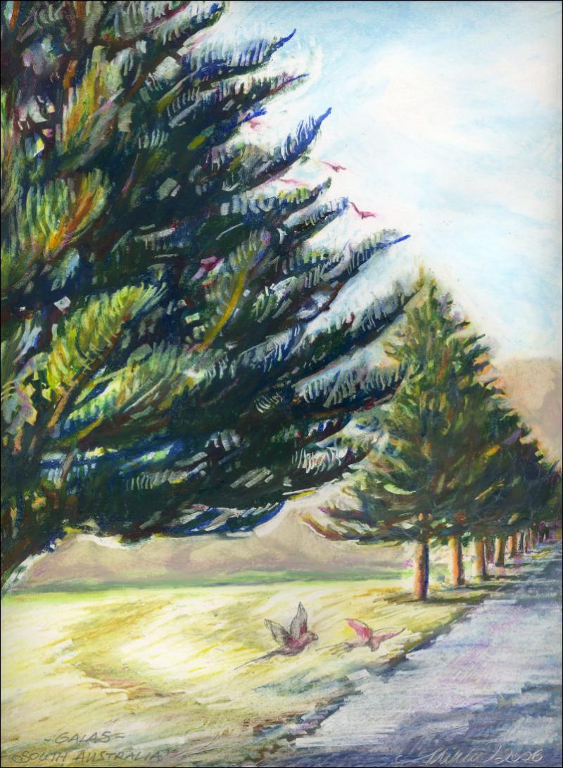
Galahs in Traffic, version 1 – this drawing started out to be a portrait of the Norfolk Island Pines growing in this coastal area of South Australia. Many of the oil pastel pieces in the Paper Places series have a first stage at the end of a day or two worth of work where it could be called finished, then after studying for a few days, months or even years, if it’s not dynamic enough it may need to be changed.
This is an area unlike any other, where flocks of Galahs flew directly into the traffic on the main highway leading to the Kangaroo Island ferry. Dead Galahs lay along the side of the road for miles. After two days of work and recalling the horrifying feelings of seeing all those dead birds, it’s clear that the drawing as it is in the stage above, is stagnant and kind of ordinary even though it could be called finished. The style needs reworking because of the subject matter and what takes place there every day.