3D
« Previous Entries Next Entries »Colours For Cameron
Friday, October 12th, 2012
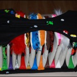
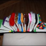
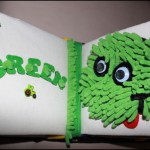
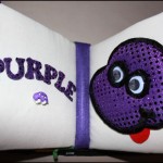
Colours For Cameron, 24L x 8H x 6D inches, mixed media on quilted muslin over cardboard pages
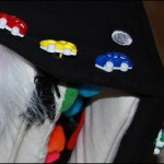
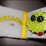
“Colours For Cameron” (Canadian spelling!) is composed over five deconstructed heavy-duty cardboard children’s books bought at a dollar store. The Monte head-templates were covered with inexpensive everyday items, so I splurged on unique notions like the $10 monkey button sewn on the ‘Brown’ page, and the cute little cars and tractors that Cameron loves. Some of the fabrics were fairly expensive, but there are enough remnants to make other similar-style projects in the future.
Each page is a quilted muslin sleeve pulled over the cardboard, and colored fabrics divide each page at the base, where they are all sewn and glued together. Rubber letters were covered with various fabrics, and each page has stuffed colored pockets on the outer edge, inviting chubby little fingers to open them..
Stepping Stones
Friday, March 25th, 2011
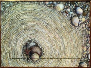
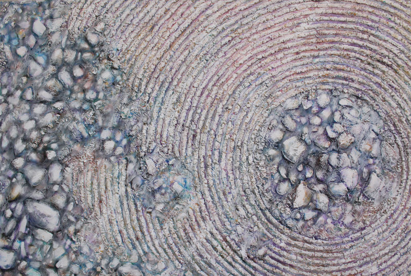
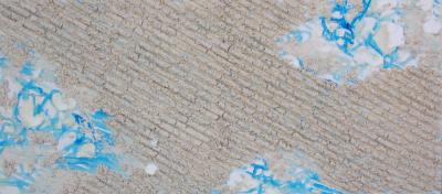
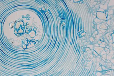
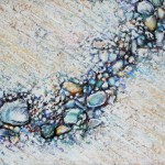
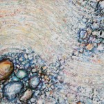
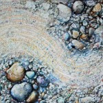
While I was in Portland two weeks ago, starting the Texas-Oregon relocation process, I completed five new Zen Gardens, filling a request for one. All five are smaller, slightly different versions of ones made previously. Four are shown in thumbnail images below.
The very first Zen Garden was created in 2000 as part of a four-painting commission. The ideas established in that set foreshadowed new routes to trying methods I hadn’t before, like enhancing my paintings with 3D elements. That set is also the origins of the “box frame” design that I’ve used on several other paintings since then, where each main canvas is mounted on a wood platform, framing the work with about four inches of extra play-space.
Whereas some frames have the effect of abruptly ending a composition, this type of frame enables space for the subject to continue, softens the edges and adds an interesting twist to the overall impression. When items related to the main subject are placed in that area it adds dimension, not just in the physical sense, but also in the conveying of any abstract or symbolic stories beyond the presentation of the main painting inside.
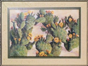
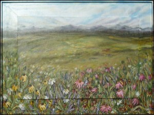
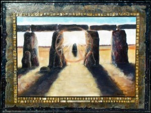
Because of the challenges acheived in those paintings, 1) a series was born that I’ll continue with for the rest of my days. In 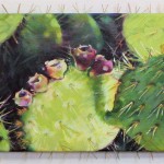 2) Prickly Pear Cactus, pins were applied around the main central frame, then painted. The smaller canvas done during 2005 (left) borrowed this technique, and the same principle of attaching things to the main frame can be used with any number of objects.
In 3) Alpine Meadows, I learned to use all the qualities acrylic paints offer by watering down the consistency for the distant mountains, then sculpted the flowers and grasses with a palette knife on the lower portion. Finally, the theme of 4), The Evolution of Communication has intrigued me ever since, but I still haven’t fully pursued the possibilities. This is the perfect means to learn about Art History hands-on by attempting to recreate it in some form, then to share that adventure and ideally, inspire interest in the topic at the same time. Two old keyboards have been collecting dust in my studio closet for a number of years, yet to be disassembled and incorporated into a new series of work with similar associations.
~
Some of our peers advocate that if we don’t concentrate our efforts to learn one medium well, we will never excel in any. They are right of course, in many respects, but scores of artists are not content with singing just one note. Some simply cannot. To be fair, what works for one does not work for another. Each of the above paintings are examples where a combination of skills and different media in one piece can be very effective. I’m here to say that integration is possible! It’s a longer, meandering road..but it is possible.
 There are so many different paths artists can take, long and short term; opportunities every day. There are endless kinds of subjects, ready-made and unconventional materials, always something to start or finish, new methods to explore, and an overabundance of ideas to attempt in one lifetime. Self discipline is the order of every day, either to start working or know when to stop.
My philosophy is that doing something, unless naturally in need of rest, is better than doing nothing. However, being overly ambitious in too many areas is also how I, along with millions of other artists end up with a variety of different kinds of art (or just stuff!), and the arguements endorsing one type of study come into play. Should we restrain ourselves when it comes to making “stuff”? Why is consistency given more support than variety when it comes to showing and selling art?
Whatever choices we make; whichever direction we take depends mostly on the intention for the finished products. Who is it for, do you want it to sell it, where, how, and how quickly? Was work done as a personally cathartic process, as a lot of art is? …or is it just a thing with no emotional attachments or brainy messages? Artists who support themselves by offering a range of services, satisfied and busy enough by word-of-mouth sales, do well jumping from medium to medium. If the hope is selling work through galleries and art dealers though, what some call “too many voices” are apt to be a disadvantage. 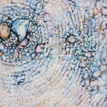
In one of his recent articles, Robert Genn writes sensitively about multi-media artists. While he supports that “for artists, exploration is like oxygen” and that “the nature of our game is to be distracted by our muse”, he also recommends that artists must present consistency in our approach if gallery exhibition/sales is what we pursue.
When a gallery represents an artist, they expect an overall consistent look and a clear statement. Where venues sell a number of artists’ work, the ambiance cannot be one that resembles a yard sale. If potential buyers view too many styles, subjects or media in one place or by one artist, they tend to lose interest, resort to window shopping, and walk away empty-handed.
 I can relate to that: the effect is like standing in the toothpaste isle at the pharmacy, where the senses are bombarded with colorful packaging, alluring titles and fine-print promises. Assuming beforehand that the choice would not be anything but simple, there have been times when I’ve said ‘forget it’ and gone back another day. With art sales though, you don’t want buyers to come back another day, because it may not be your art they choose then.
Gallery owners and dealers do not do us any favor if they display too much variety in typically limited spaces, so Mr. Genn has an excellent suggestion: bring art done in different medias to different galleries.
He also says to keep working no matter what.
Artists have a strong sense of mission. Periodically it needs reevaluation, and with that bigger picture clear, we create the way as it unfolds before us. If we are serious about selling, we first need to become familiar with what we are best at, what we love, what works and what doesn’t. We need experience in order to learn – that takes time – and there’s no getting around it. Experimentation is fundamental to this profession, but if it’s intended to be sold to others and by others, simplifying the look and clarifying the purpose of our art is crucial.
 A viewer at one of my exhibitions commented, “You’re all over the place, arentcha?!” As disturbing as that was, it’s true and I needed to hear it, eventually concluding that I do need to clean up my act, but at the same time this is how I work. This is how my stuff works. Every so often there are paintings or a series of works that encompass all that’s been learned and all that I’m capable of; breakthroughs that define a solid new direction or validate the existing one. The commissioned set of paintings described above were like that, and their significance is still an influence on today’s work and will be on tomorrows’ too. They verified that I’m on the right path even though much of the time is spent off of it, experimenting. I call it serious play and paying attention… “playing attention”! Once in a while the bits and pieces come together in one big rewarding “Eureka!”.
Practical design
Tuesday, December 21st, 2010
“Necessity is the mother of invention.”
Aesop’s Fables
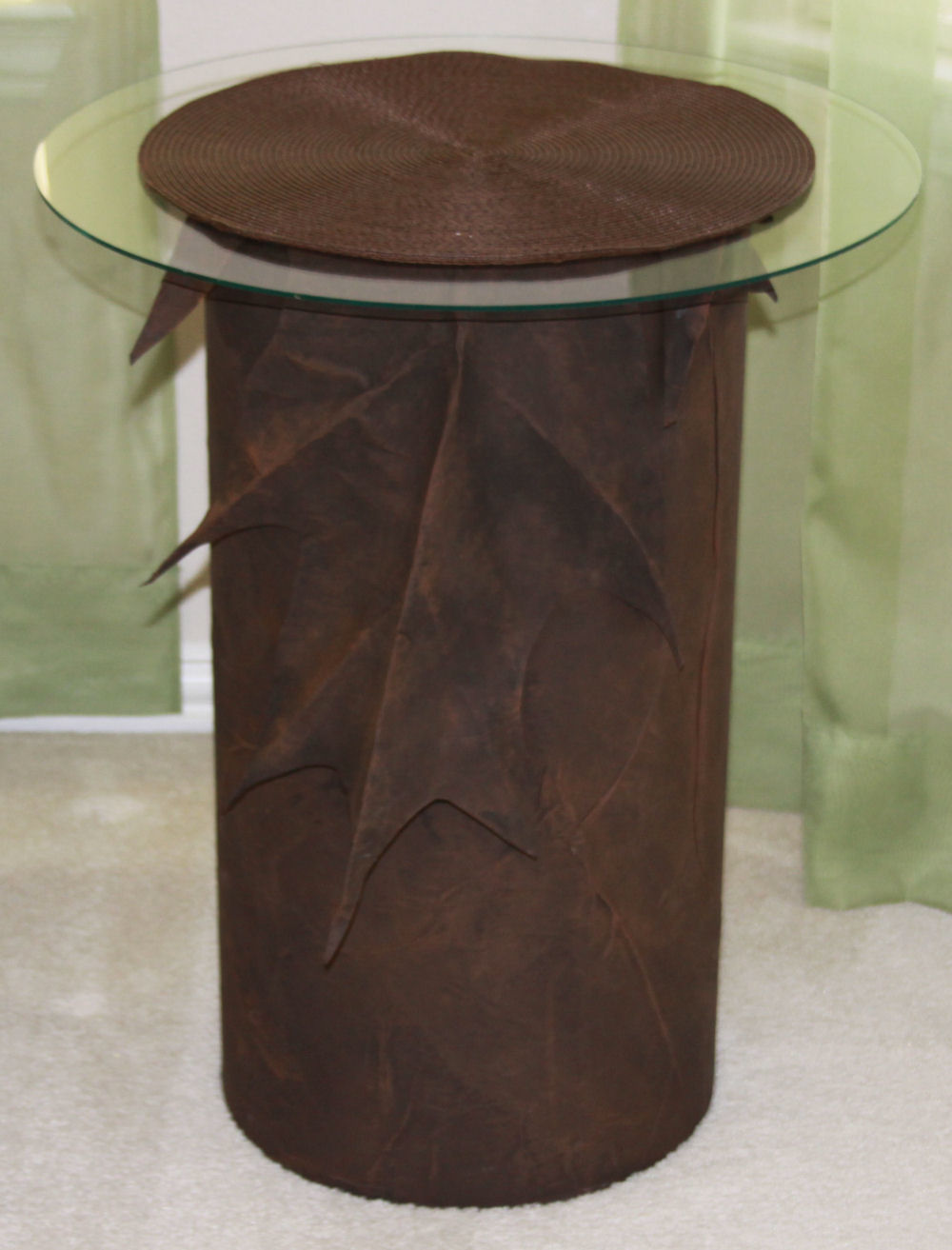
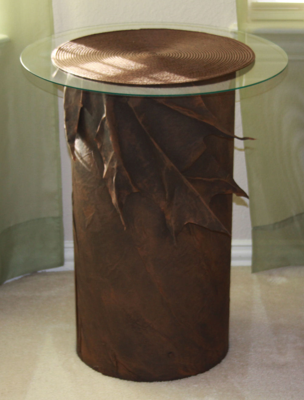
Oak Leaf bedside tables, 24H x 12W inches with a 20-inch glass top. Large, crinkled paper mâché leaf-shapes are creased, folded and arranged over the top of heavy cardboard tubes. The tubes are available in a variety of dimensions, sold in hardware stores as use for cement foundations.
I’ve had this idea to make bedside tables for a few years now, and selling the house, prepping it in a minimalist way for viewing has motivated me to finally make them. Faux suede effects were the intention here, and I’m pleased with the results. it really does look like suede. A brown circular woven mat covers the glass and hides the space looking into the tube.
Zen Garden #10 almost finished
Wednesday, November 10th, 2010
Zen Garden 10, 40 x 60 x 3 inches mixed media on canvas.
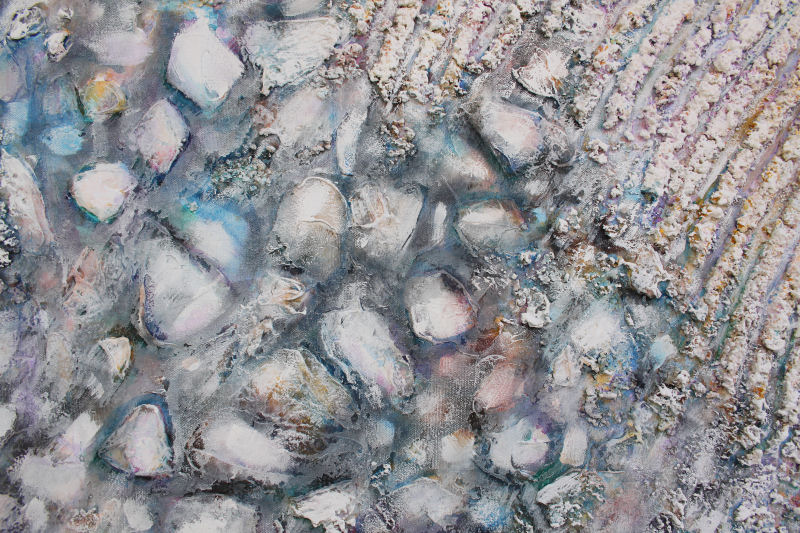
The final stages of this paintings will be finished as it hangs on a wall. As seen in a realistic room setting, it will be easier to spot whatever might make the composition more interesting. Some colors may need to be re-enhanced to add more depth and definition, but I also like the overall faded look, so we’ll see. The texture continues around all 3D edges. This painting is extremely heavy, as it is on a home-built canvas stretcher, so it will be transferred onto a lighter-weight stretcher if it sells. It will still be stable, but practical. All paintings in the Zen Garden series are wired to hang in any of 4 orientations: vertically or horizontally. Below: details of left central portion as seen in the above.
Zen Garden #09 and #10
Tuesday, November 2nd, 2010
Zen Garden 09 work in progress, 48 x 21 x 2 inches mixed media on canvas
The perfect painting in a room can elevate the atmosphere of the whole floor, and sets the tone for showing off the entire house. With selling the house in mind, I’m trying to choose a decent painting for our living room, because Zen Garden 02 sold, so I decided it’s worthwhile to make two more for the series.
Zen Garden 10 outline, 40 x 60 x 3 inches Mixed Media on canvas
Painting is always meditative, but I find it especially so when creating pieces in the Zen Garden series. This kind of work does not present the same kind of emotional concentration or intellectual challenges that other paintings do. There are few struggles and hardly any decisions to make, except to find cooperative materials. Once the outline is accomplished it’s pretty straightforward compared to other forms of painting. The outstanding difference is that each stage in these 3D paintings requires time and patience to allow areas to dry before proceeding. The Zen Gardens can be drying in stages while other work gets done too, and the multi-tasker in me is quite happy to be accomplishing many things at once!
 Art supplies are expensive. Most will last long enough to justify purchases, and much of the time you get what you pay for, but some items are ridiculously overpriced. Keeping material costs down is essential so they aren’t reflected in the final price, but quality should never be compromised. Still, there are ways to get around any dilemma, and there are alternatives for everything.
When I started the Zen Garden series ten years ago using modeling paste and textured gels, jars were about $15 for 250 ml. Since then I’ve experimented with various unusual materials, and shopped everywhere to compare prices. It’s still more economical to purchase brand-name products in larger quantities – if you can find them. There are some fun mediums available now too, like gel with tiny glass beads in it. Prices for art supplies do not seem to waver over time in either Canada or the U.S., so I reserve the brand-name mediums to sculpt the rocks and highest quality paints do the finishing touches. Here I’ll share a few of the trade secrets I’ve discovered over the years, and you can create your own Zen garden painting.
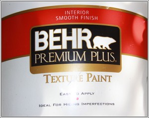 As a base for the raked sand mixture, it’s worth purchasing a large 2 gallon (7.58 L) pail of textured paint. I purchased Behrs at Home Depot in Canada, and it looks like Ralph Loren has the market cornered in the States. Watered-down drywall plaster can be used also, but I recommend attention to how heavy the piece may be when it’s finished. Mix in copious quantities of white glue, large containers of white or light-colored acrylic craft paints, and anything water-based that will extend the liquid mixture and bind well with the dry ingredients. Sand, even popcorn kernals and/or rice can be added for texture. Other objects can be incorporated too…just use your imagination. For example, and this is my most valuable secret, unscented kitty litter from the dollar store, the non-absorbant kind, looks exactly like tiny stones and is light in weight.
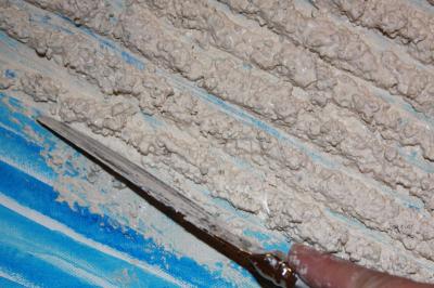
Zen Garden 09 details: applying mixture with a knife, sculpting rows
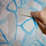 The mixture can be put in a ziplock bag with one corner cut out, but I discovered that it’s more efficient – however messy – to spread small portions out onto the surface with a knife and hand-mold it. Keep a wet cloth handy to wipe your hands and the utensil often.
Drywall plaster makes nice-looking rocks, plus it cracks well for a parched-earth look, use sparingly because of added weight. Wood filler is a lighter alternative, much less expensive than professional brand gels and mediums. Modeling pastes do not lend well to sanding or carving when dry, but wood filler can be sanded and re-shaped.  Also, if it dries out completely, chop it up, add water then seal the container for a day or so. This is where you can experiment with whatever helps acheive 3D effects. Art, craft, hardware, department stores and dollar stores carry generic brand basics, so it’s worth researching and shopping around.
When it’s all dry, rocks and other details are outlined and painted with pure colors, then all covered with a coat of primer. The colors are all reapplied to further enhance rocks, then brushed white, skimming across the entire surface. This process is repeated until you are pleased with the results by a final coat of white with remnants of the layers of colors poking through underneath. As far as acrylic paints, you do get what you pay for, but price differences are mostly due to pigment quality and viscosity, which, until final stages is not really an issue. Inexpensive acrylic craft paints are perfect as a filler (only).
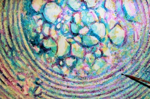 Zen Garden #10, above and left is already quite heavy, so about 1/4 of it will be painted rocks, keeping the sand patterns to a minimum. There is enough mixture that could dry out if it’s not used right away, plus it’s great to make multiples while all the mess, materials and utensils and are out, so I’m doing two simultaneously. There may even be enough for 3!
The necessity of work, especially if it’s at home, seems less like a chore if you dangle some kind of carrot for yourself every day. Sometimes having too much to do is more exhilarating than exhausting. Each day, though work as an artist can be considered by others as play, the energy, motivation and circumstances are unpredictable.. It takes self-discipline to find a way to go with the flow and still get work done. The good thing about this occupation is that it is flexible in every way. The creative compulsion seeps into every other activity, and there is almost no way to not add a little something extra.
A continuing saga
Friday, October 22nd, 2010
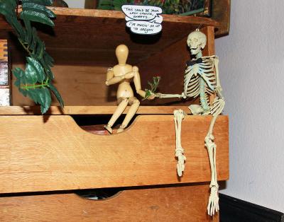
“This could be your last chance, Sweets. I’m moving on up to Oregon.”
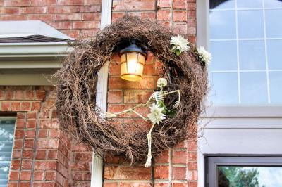
The Studio Affair saga on previous blog posts: October 20th, 2009, October 28th, 2008 , October 30th, 2007
That’s right, me and all the skeletons in my closet are moving to Oregon, so the painting now is all about walls. I’ve bought a small 4 x 6 sketchbook, hoping to sneak in some time to do a few thumbnail drawings of my travels this year.
The past six months: starting with driving up to Madison, Wisconsin at the end of April to set up the Dancing With Trees Exhibition. After the show opening, it was back to Dallas then shortly afterward to Singapore for 3 weeks. That was amazing! Two days after returning from Singapore I drove up to Ottawa, Ontario to visit our sons. At the end of June, I then drove back down through Michigan to meet my internet artist-friend, Virginia Wieringa (triple amazing!) then across to Wisconsin to pack and pick up the DWT show, then through Chicago to drop off Morning Light 01, through the U.S. Midwest and back to Dallas.
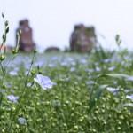 Two weeks later I drove up through Oklahoma and North Dakota into Saskatchewan, then into Alberta to visit family. I took so many photos on the drive east across Canada two weeks later (mostly tree photos of course), through the prairies and the Great Lakes region back to Ontario, where I stayed for another 2 weeks. Then back down to Dallas again! During September we found out that my husband is transferred to Portland, Oregon for work. So the first week of October we both drove west in separate cars, across the Continental Divide, in awe of the gorgeous red rocks and incredible geography in AZ and Utah, finally reaching our future home west of the Columbia River Gorge, and just east of the Pacific Ocean shores and north of the Sequoia and Redwood forests. I drove back to Dallas with a truck and trailer to refill, and will make the trip across only one more time before winter – hopefully the weather holds up. I’m excited to get to work again after such a crazy year of travel – lots of inspiration.
Good things come in threes
Wednesday, February 10th, 2010
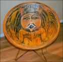
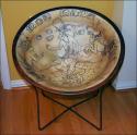
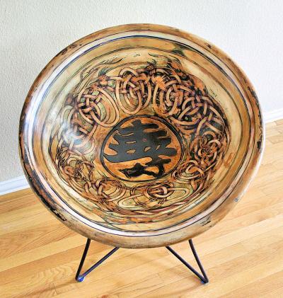
Cycad Fossil Chair, Salish NW Pacific culture wooden whorl replica Chair, and Ancient Mayan bowl replica refurbished vintage chair, 29 x 29 x 29 inches mixed media. Read the feature article.
On exhibit and available for purchase February 11th – 27th at Visual Image Fine Art Puiblishing and Gallery Juried Show, 14320 Midway Road, Suite 300, Dallas, Texas. Come and meet all the Artists at the Opening Reception this coming Saturday, Feb. 13th, 3 – 9 p.m.
~
Good Artist Pals also come in threes
Some friendships will last forever, and how fortunate that three of mine also happen to be artists! Listed in no particular order of favoritism, each are miles apart geographically speaking and personality-wise, but they all have one thing in common: they’ll tell it like it is if you ever need a good critique, and on the flip side of the coin: a smile, a boost of energy; encouragement. I’ve posted my favorite works created by each, and highly recommend browsing each of their websites..
a) Chris Bolmeier: Happy Pigs, Oil on canvas I met Chris on the internet three years ago through Robert Genn’s Painter’s Keys newsletters. Formerly an actress and professional singer, she’s not through yet with entertaining you through humour, song and paint. She often posts mini-videos of herself singing, and her artwork is pure, straight from the gut, and some of the funniest, most original material ever. I chose this piece to share as an absolute favorite, portraying fanatically goofy pigs because it makes me laugh…not just smile, but laugh Christerically every time I look at it. In my opinion her best work is of childhood memories, and some of the baffling stuff that originates from who knows where in the infinite canvas of her mind!
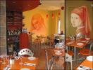
b) Karen Xarchos: Restaurant mural in Ottawa, Ontario, Canada Karen and I were neighbors many years ago. We designed and painted murals together in the Ottawa area for a couple of years. Thank goodness for the internet, we’re able to keep in touch when either of us needs a good eye and some honest advice. Karen’s style and mine are vastly different; our pace, the style, the manner and we continue to learn so much from each other. She reminds me to slow down and smell the paint; her blending techniques are amazing.
Karen accepts commissions for canvas pieces like wall borders painted at home, then cleverly installs them with wallpaper paste so home owners can remove the work and take it with them when they relocate. My favorite work of Karen’s are the murals depicting work of the Masters, which are enjoyed by customers dining in many of the Greek and Italian restaurants in the Ottawa area.
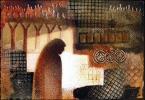
c) Virginia Wieringa: Prayer, mixed media collage Virginia and I met about four years ago on an Artists’ interactive website, wetcanvas.com, and I think she still participates there under the avatar name “Veedubya”. I’m positive she’d love to meet you there too. Virginia has well-developed drawing and painting abilities and currently experiments intuitively with mixed media collage. Her work, no matter what the media, reflects her open-mindedness and strong sense of spirituality. Formerly an Art teacher, she’s fun to write to because she puts up with my inner-most silly self and doesn’t hold back her own. My favorite work of Virginia’s are the subtly symbolic collages, and some of the more vivid, energetic paintings that are about two phases pre-Realism.
The Tree of Life Chair
Monday, November 30th, 2009
The Tree of Life, 29H x 29W x 29D inches mixed media; refurbished vintage plastic lawn chair, woven canvas strips and white glue, thin layers of drywall compound: cured, sanded, carved, acrylics paint, varnish. Durable, completely functional.
There was an interesting buildup of colors after a lot of changing colors and repainting the design many times, so the impressions of this chair are created like the other chairs in this series; ancient artifact replicas. The other chairs are listed here.
Bird Party
Tuesday, November 17th, 2009
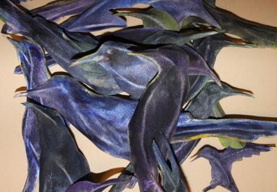
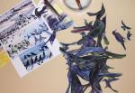
Bird Party, watercolors on molded 140 lb watercolor paper, work in progress.
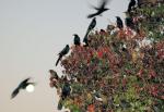
I’m not exactly sure where this is headed, but shapes were cut out of the painting, the paper drenched, folded, stretched and sculpted. Every evening just before sunset in the Dallas-Fort Worth area Grackles, blackbirds, Starlings and pigeons gather on lawns, parking lots, overhead wires and cables, roofs and trees. The event is unique to this area as far as I know, and exciting beyond words to be amongst the thousands and thousands of birds. Here is a previous piece on the subject.
The Studio Affair
Tuesday, October 20th, 2009
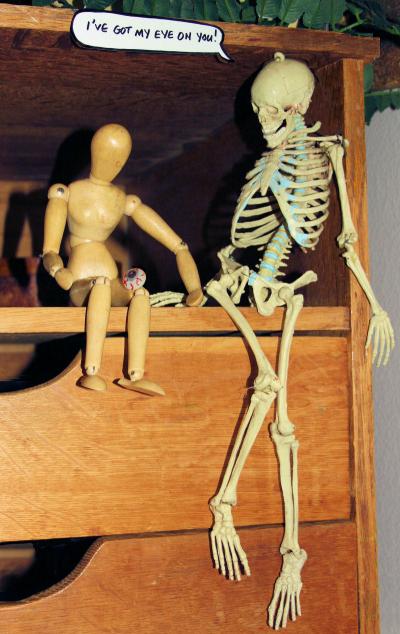
“I’ve got my eye on you!”
See the other years Halloween posts on October 28th, 2008 and October 30th, 2007
« Previous Entries Next Entries »

