
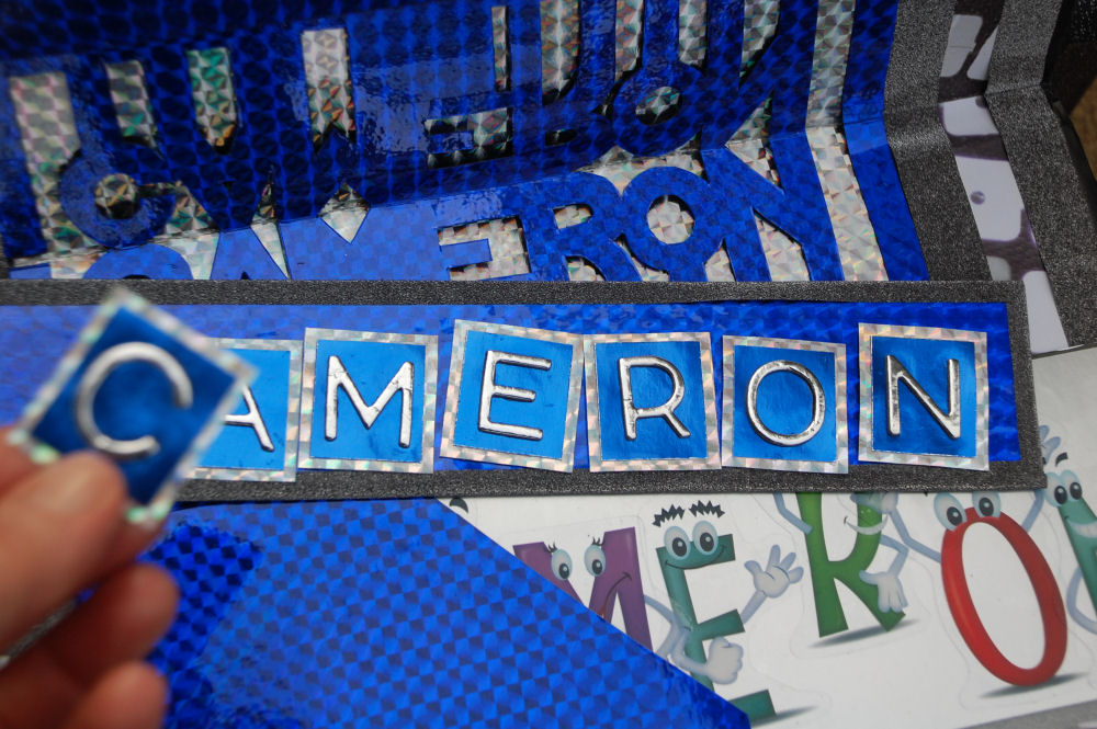
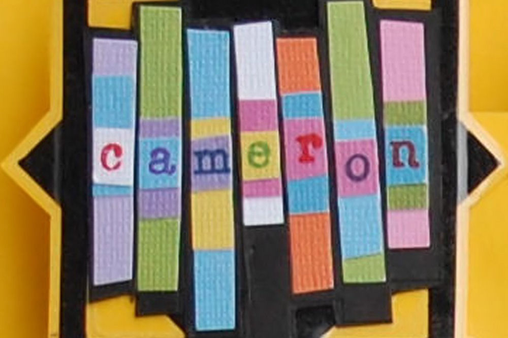
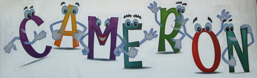
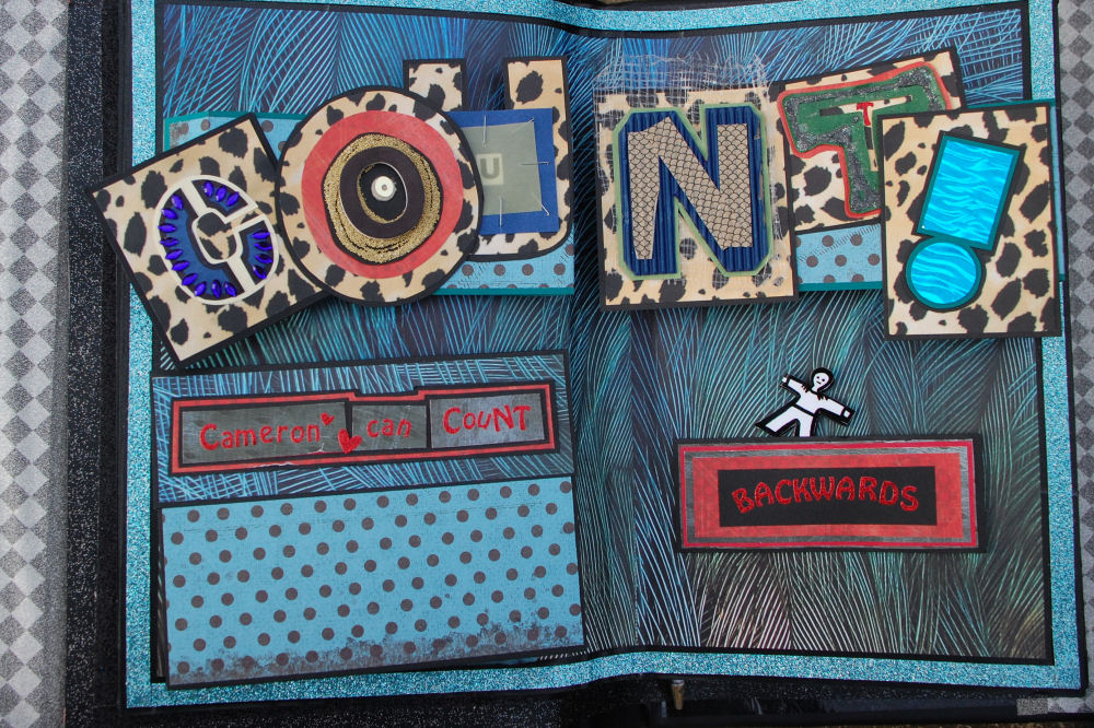
Cameron Can Count Backwards
Thursday, March 19th, 2015
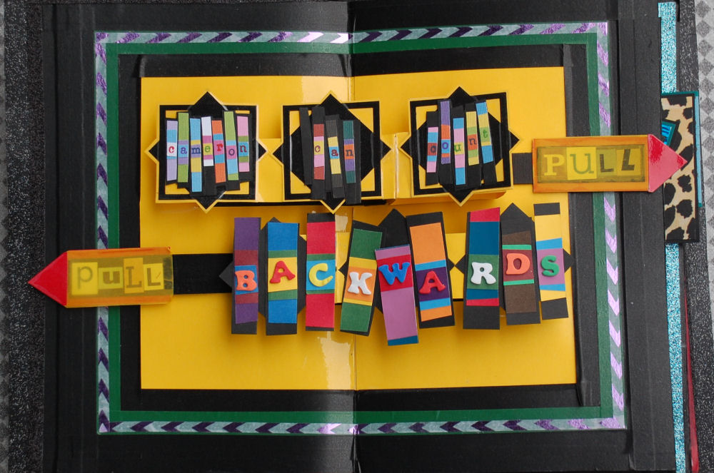 July 2014 – March 2015: Cameron Can Count Backwards
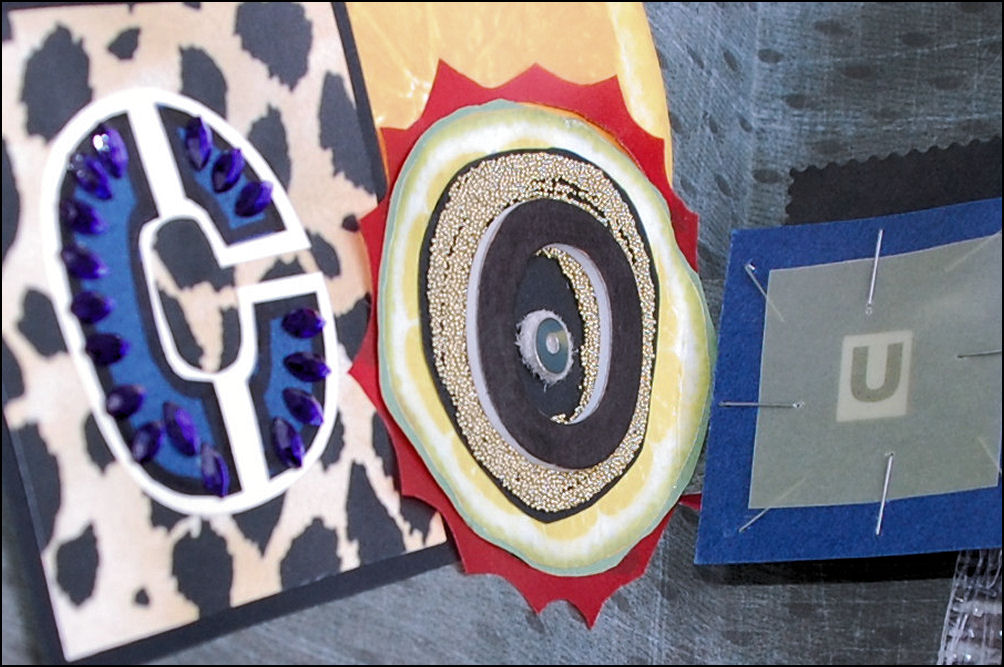
When Cameron was still two years old and I asked him what kind of book he’d like next, he answered “Cameron Can Count”. To fulfill his wishes, and my own for a clearer direction since that was the book he got last year, the compromise is a ‘backwards edition’ in the form of an interactive pop-up book. Searching the internet, there are a whole spectrum of paper-oriented art forms, from the craftiest, stamp-iest, cutsey Kricut machine-cut pop up cards to stunning, intricately engineered paper sculptures. The best website sharing easy-to-learn pop-up basics is Extreme Cards and Papercrafting.
 Starting with research and experimentation, I spent a couple of weeks making prototypes out of plain card stock. There are fantastic selections of decorative paper, tapes and trim designs available in craft stores now, and purchasing these things helped spark imagination and theme visualization. Supplies can be pricey, but less so if using coupons and waiting for sales. There were plenty of miscellaneous materials already on-hand, and the dollar store is always a good resource for finding things like the magnetic car game which was pulled apart and reassembled into a name-spelling activity.
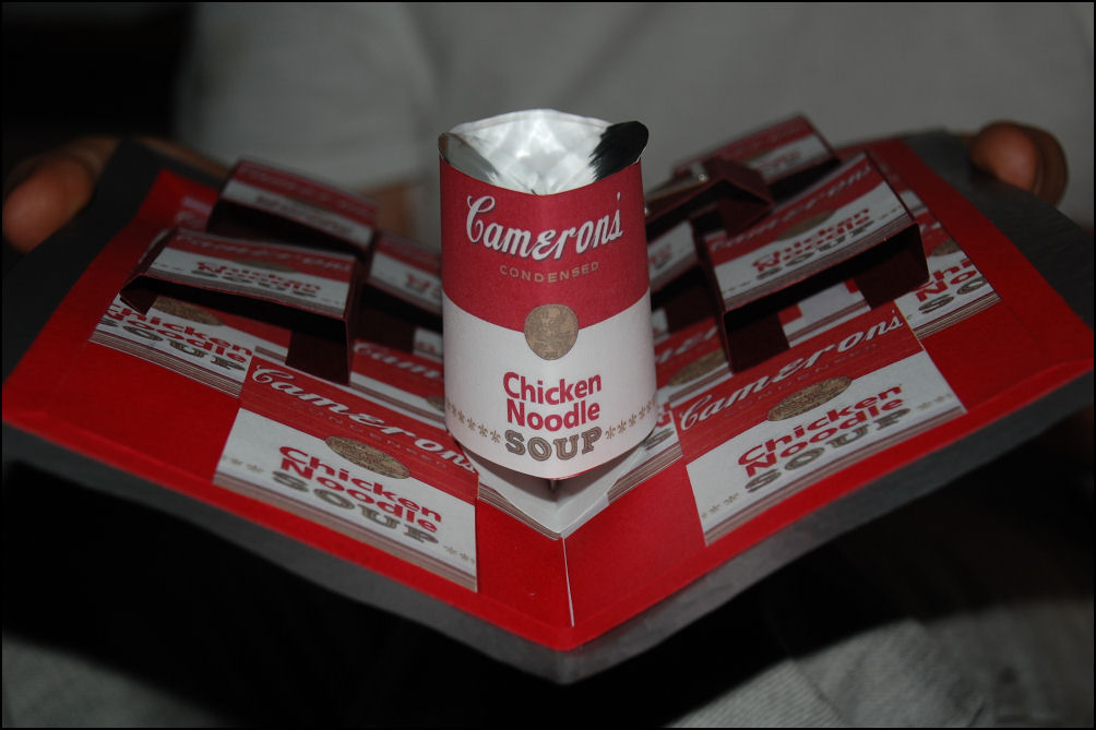
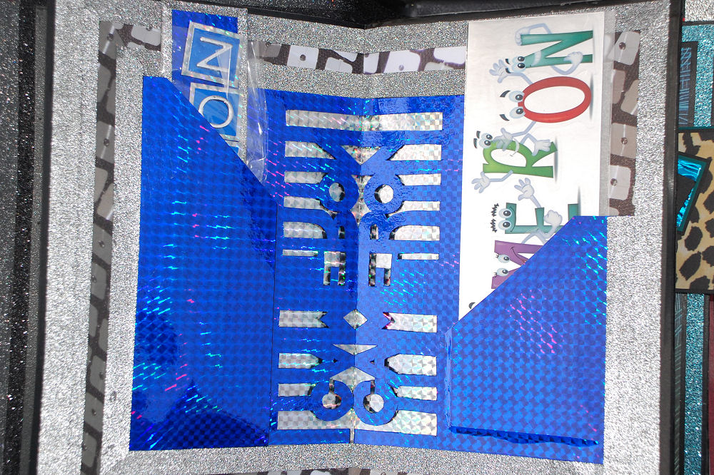
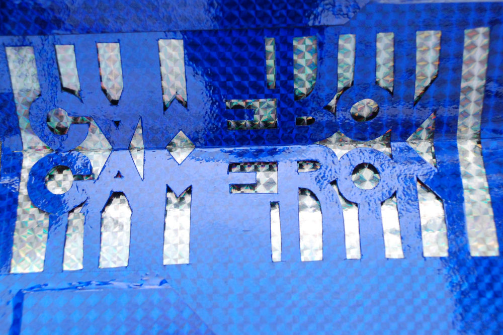
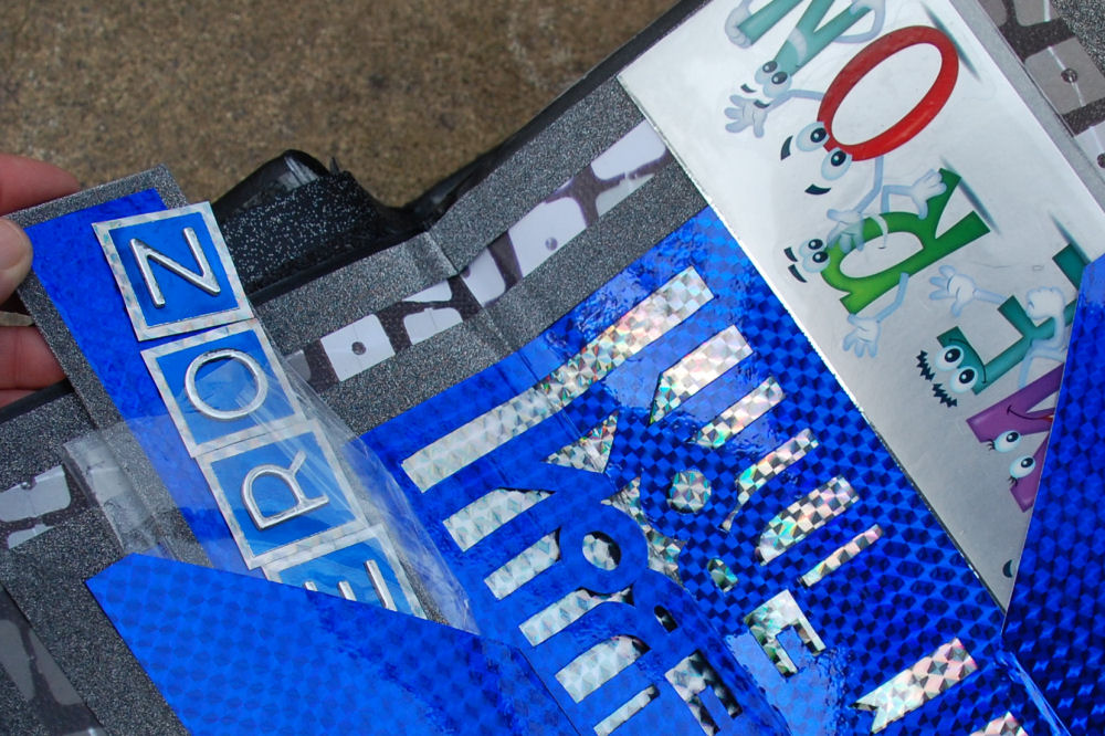
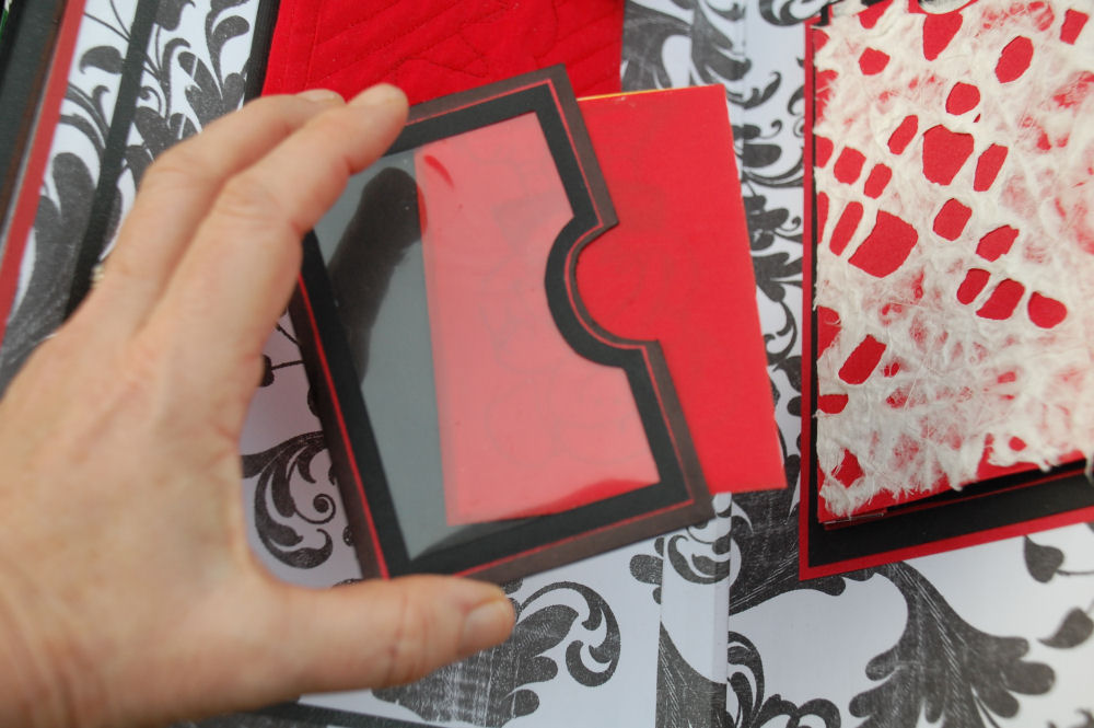
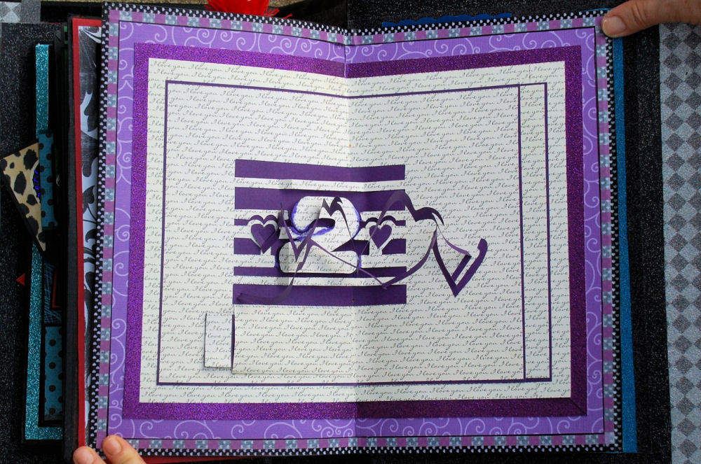
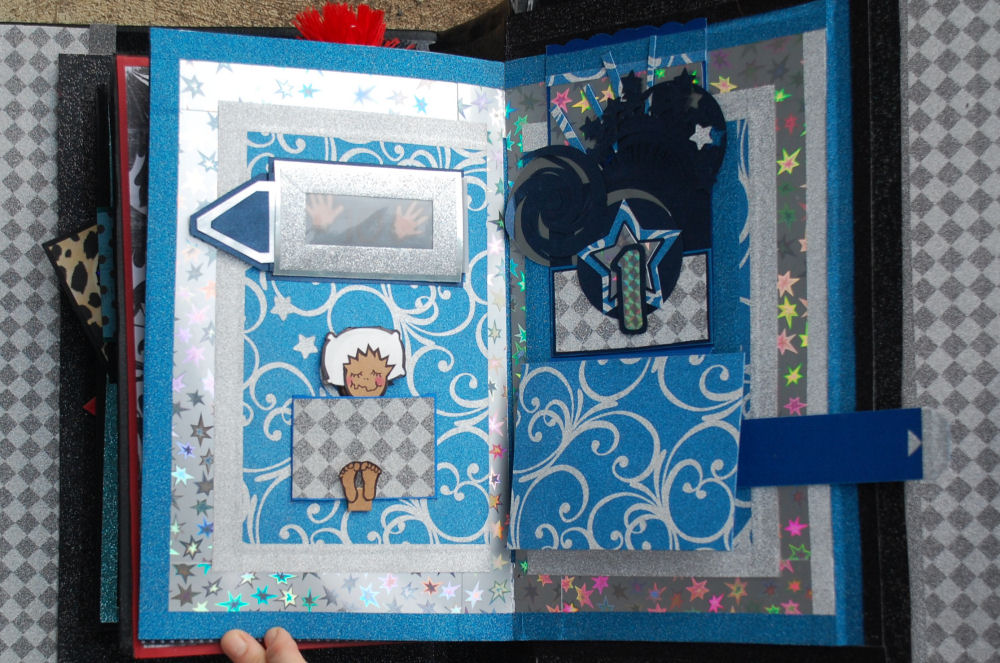
After the initial creative buzz, somewhere along the way a certain amount of restraint is called for, not just in shopping, but in choosing which pop-up tricks to put where. For me, this stalled the process quite a bit. I was fairly overwhelmed by wanting to include all the bells and whistles, but it’s just not feasible to do every idea that “pops up”. Not only will the pages seem muddled by too many ideas, but increasing the mass presents a super challenge when binding the whole thing together. Mechanisms also need space to work properly, and a book like this needs to be comfortable to read. These were things that only experience could teach. Admittedly, there are a few clunky pages with things falling out of this book. Perhaps with the next book I’ll be able to exercise more of that restraint. Ah, realistically, probably not! 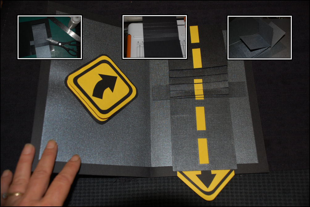
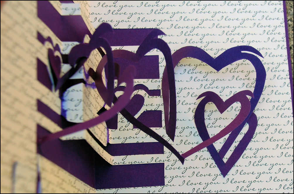
Balanced with the fun, more ornate facets of book-making, particularly with a pop-up / interactive book, learning and perfecting the basic structural elements cannot be overemphasized. The mathematics of paper mechanisms are unforgiving, and a millimeter off at the start can add up if things are not corrected as much as possible before going forward. Some of the folds are tricky, especially with pop-out lettering. Clean hands and work surfaces are extra important. Some papers show finger marks or buckle too easily, not practical for pop-ups or for children’s books. It becomes necessary to slow down, simplify, think ahead, see how things work, take extra care, and find the kind of patience you didn’t even think was obtainable.
Translating the 2 dimensional into 3 dimensional can be frustrating, but as is repeated so often in my blog articles about creating anything, mistakes are a beneficial part of the learning process. It’s definitely hard to have faith in that when pages have to be redone several times though, and some papers are pretty expensive or hard to find again. Well, experience and confidence are earned, and it ain’t cheap!
 Each year my books for Cameron will be age-appropriate. He and his little visitor-friends are likely to turn pages harshly and press books open beyond stress points, that’s to be expected. These pages are made primarily with card stock and paper, and some have delicate parts far from durable or practical in a three-year-old’s hands, but young children already know about special things, and if they don’t, it’s the best age to guide them to treat things respectfully. Books are not like toy cars, and Cameron knows the difference. This will be more fun to read with an adult anyway, and it will be given a safe spot on a shelf until it’s time to read.
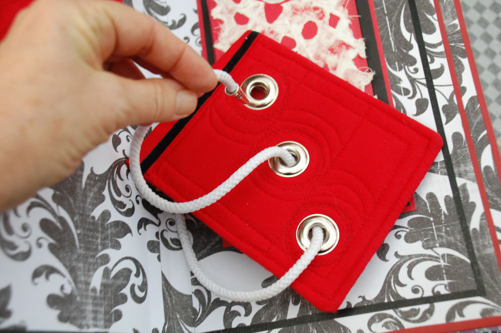
‘Cameron Can Count Backwards’ was started in July 2014 and just needs finishing touches. It’s March 2015 as this is written, and the book has been bound, but fairly ineffectively. The spine is not wide enough to open pages effectively. It could pass, but why do all this work to have it not open adequately? This setback offers a chance to sew the cover in soft faux leather and improve the overall quality. I’d like it to look like a very old, important, expensive book.
 |
 |
 |
 |
 |
|
 |
 |
 |
 |
 |
|
 |
 |
 |
 |
 |
|
 |
 |
 |
 |
 |
|
 |
 |
 |
 |
 |
|
 |
 |
 |
 |
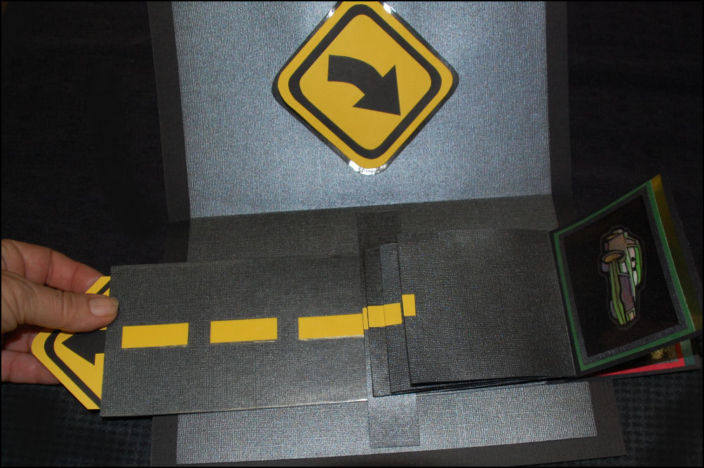 |
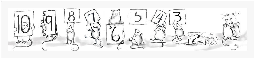
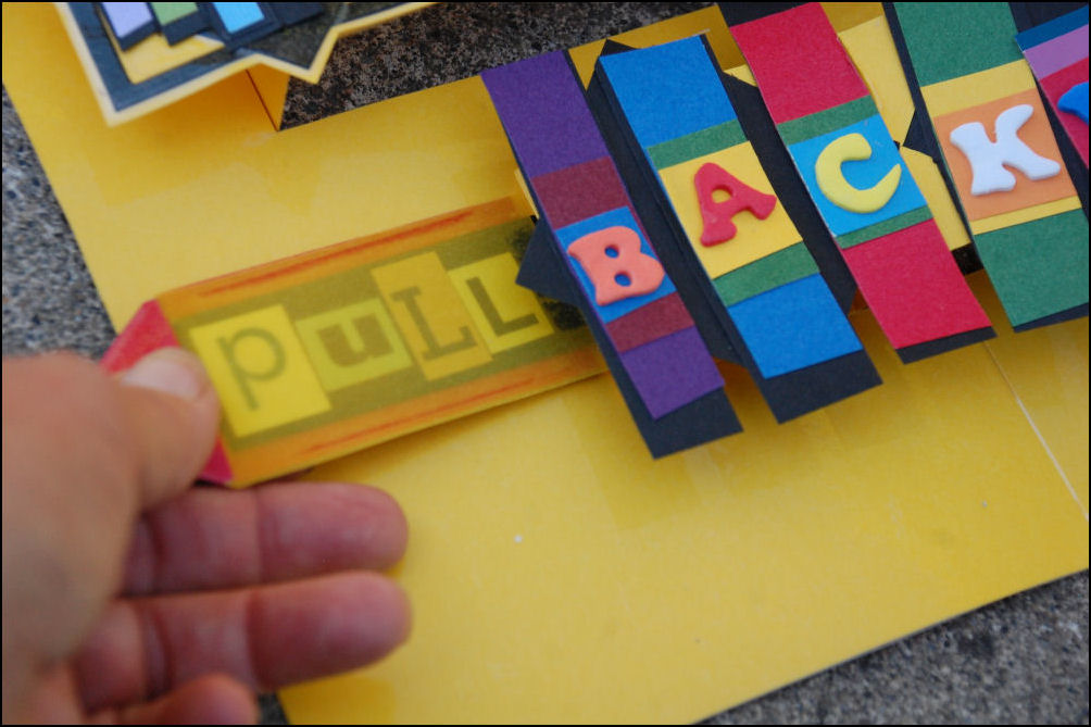
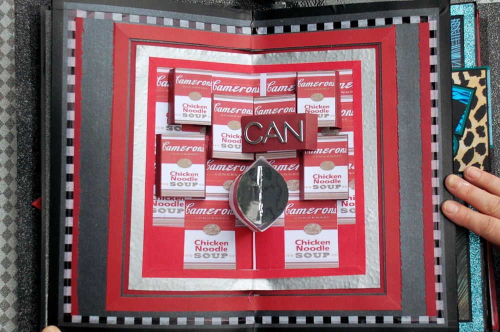
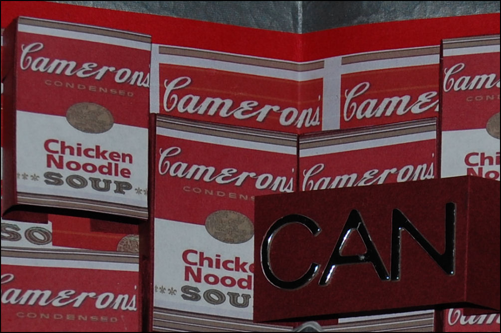
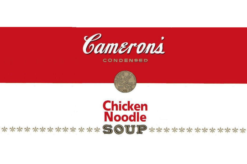
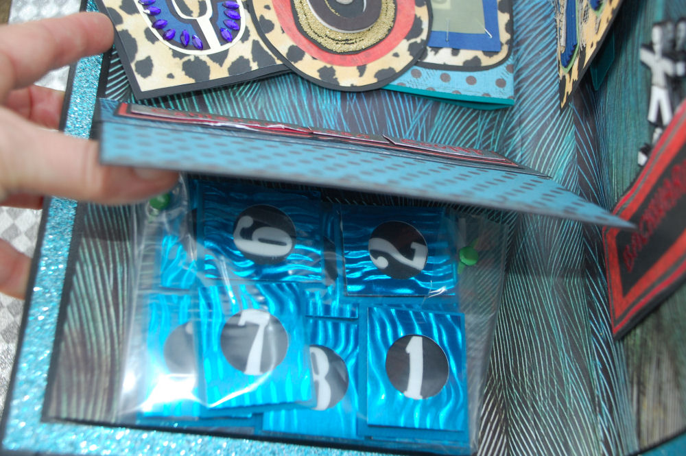
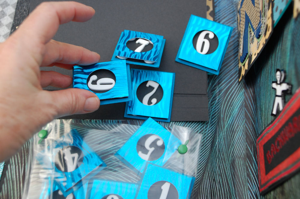
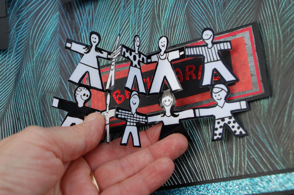
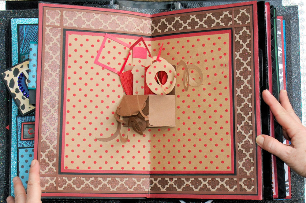
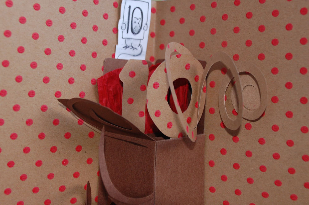
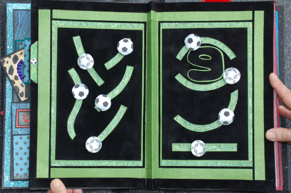
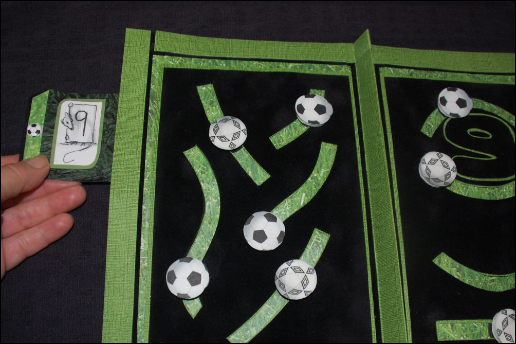
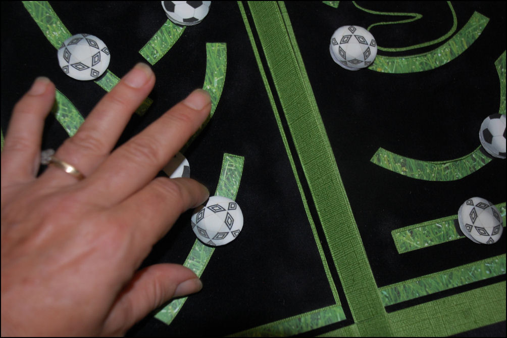
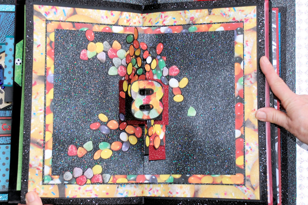
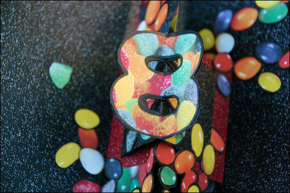
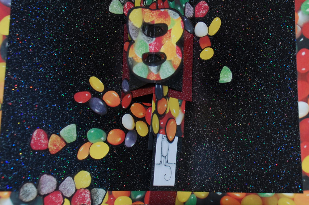
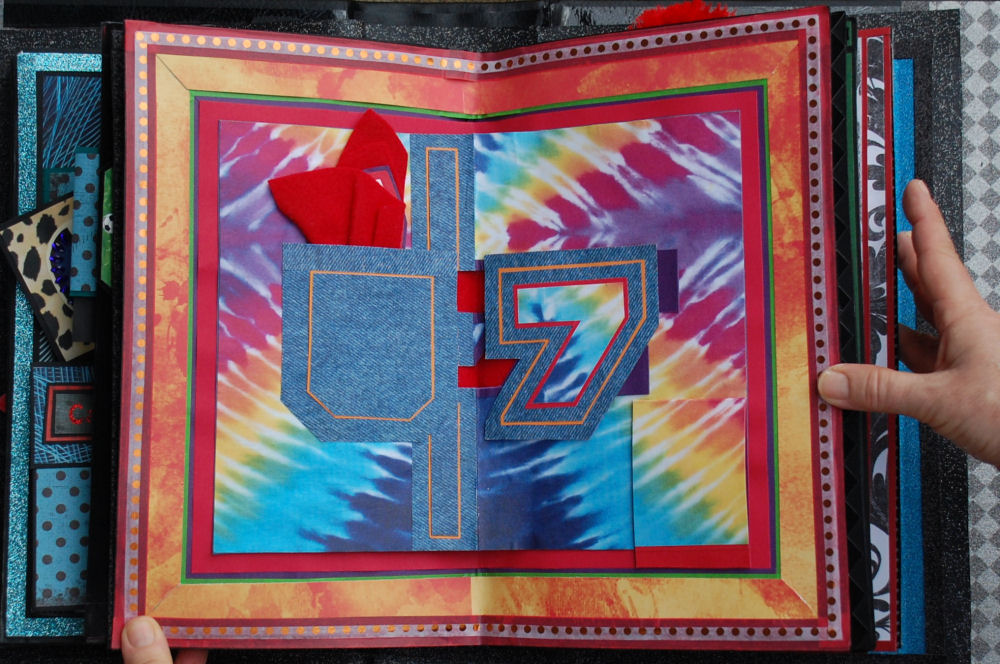
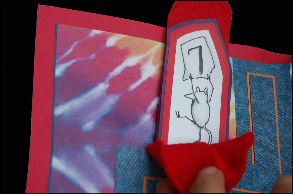
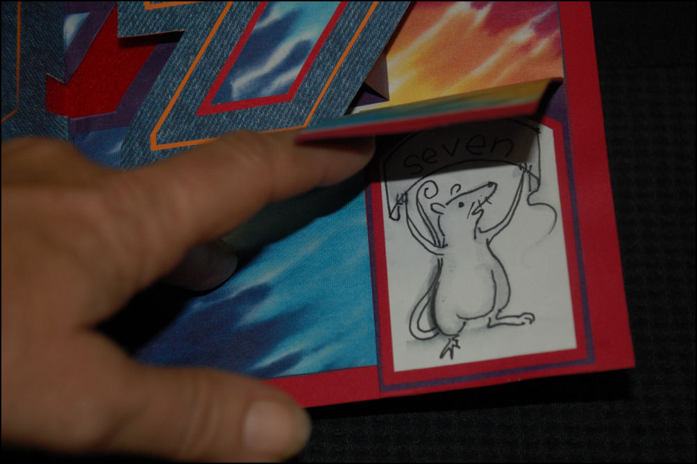
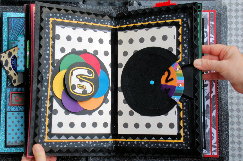
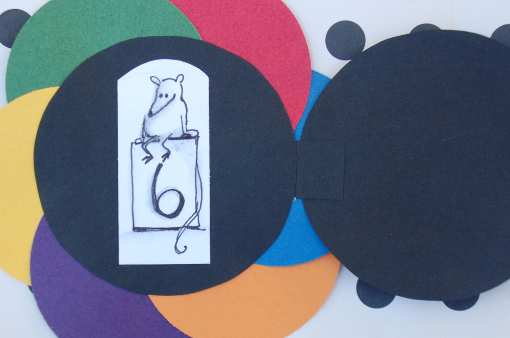
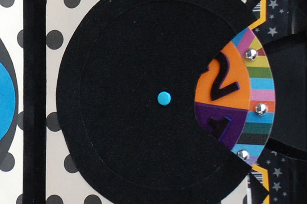
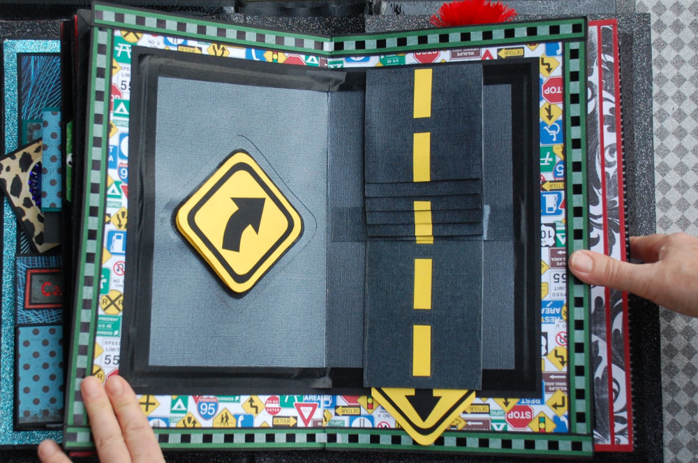
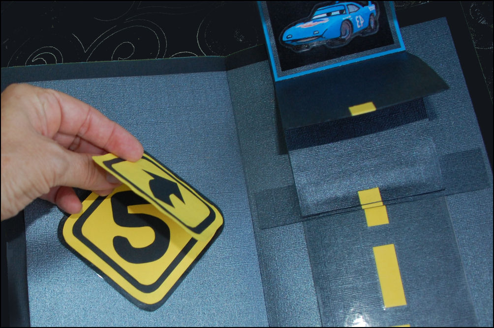
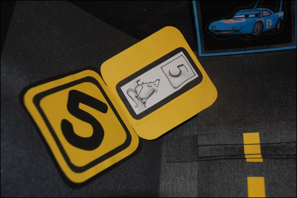
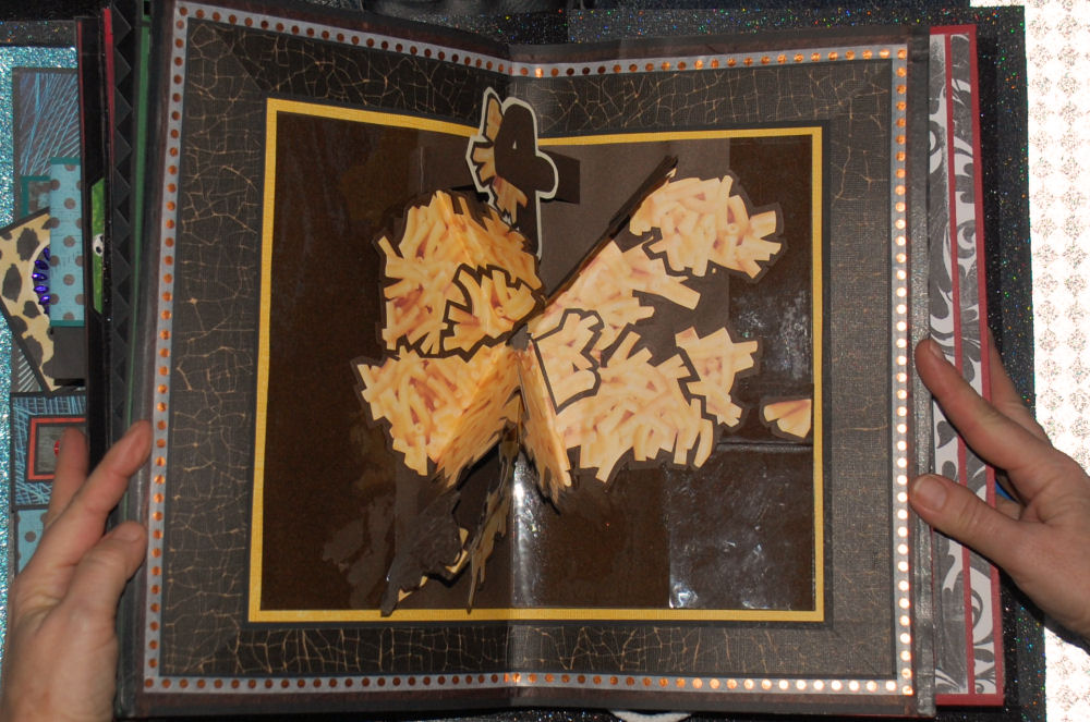
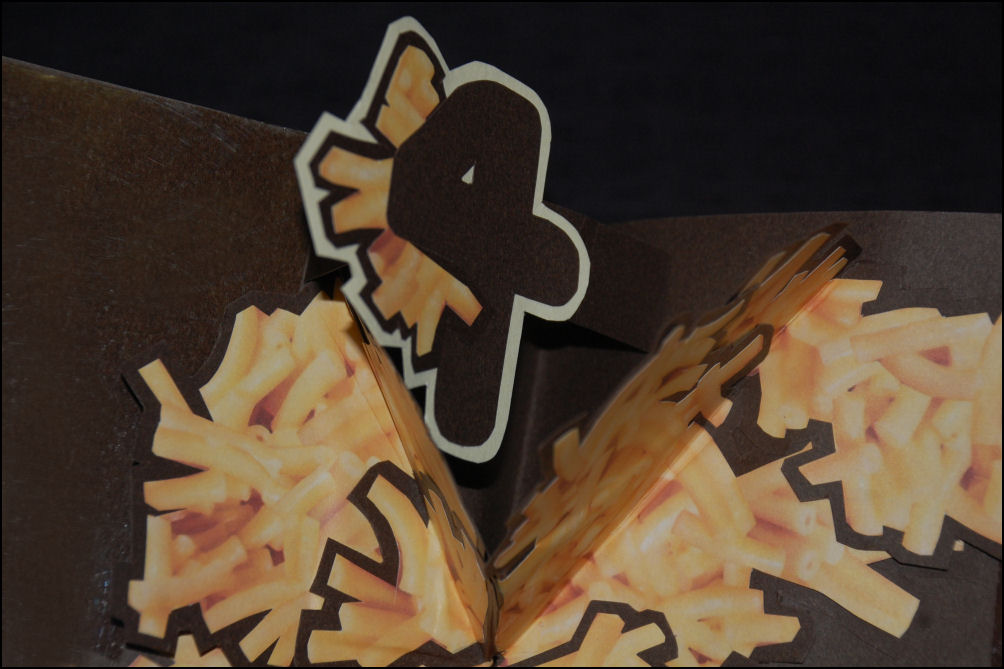
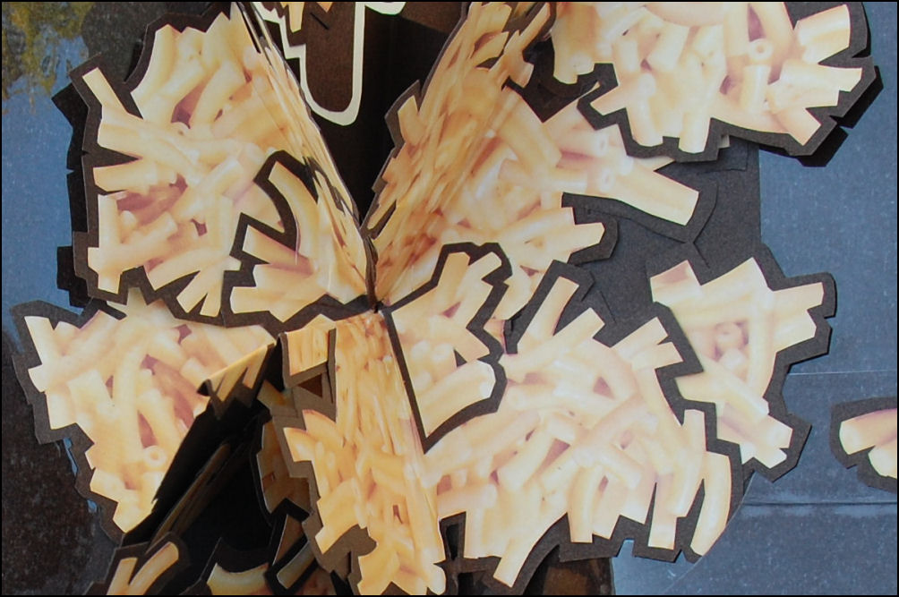
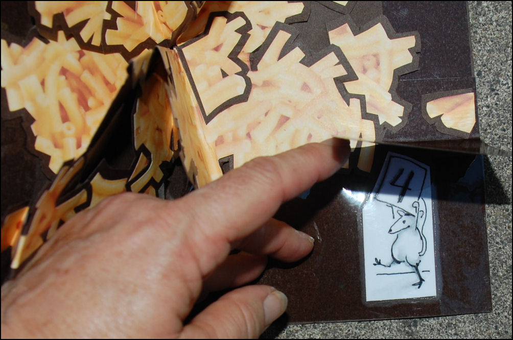
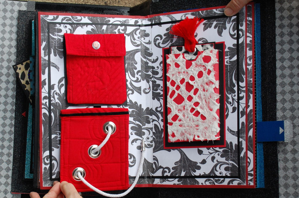
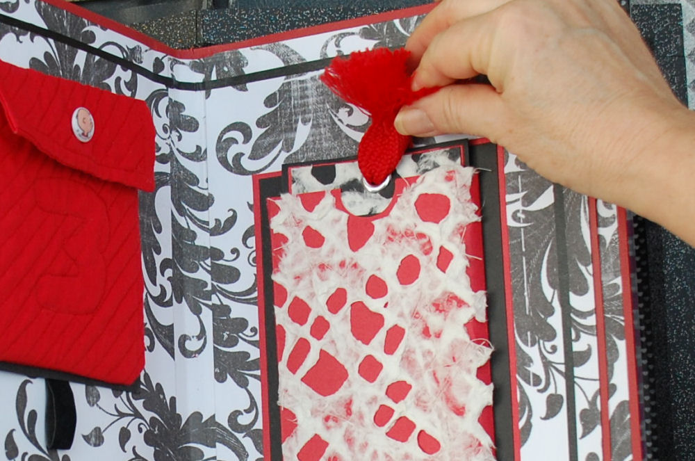
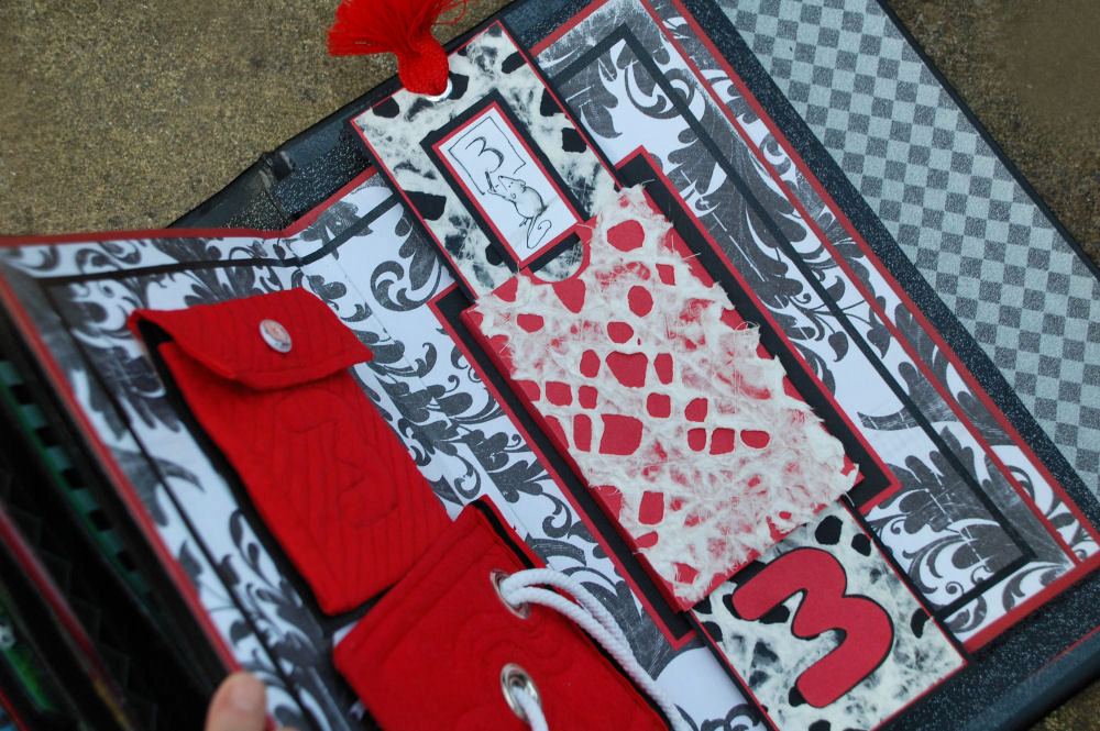
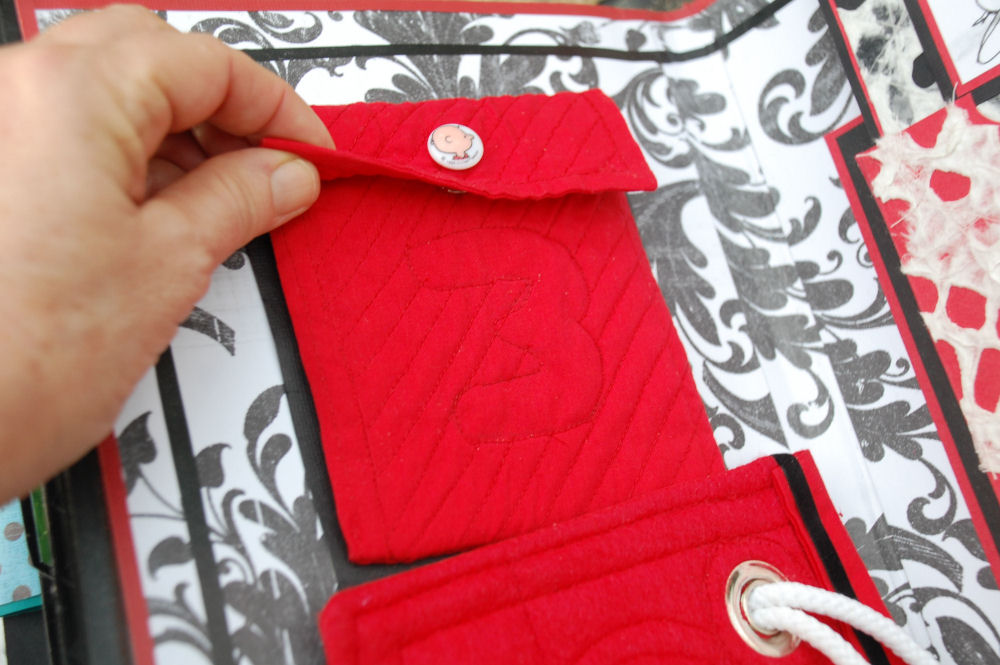
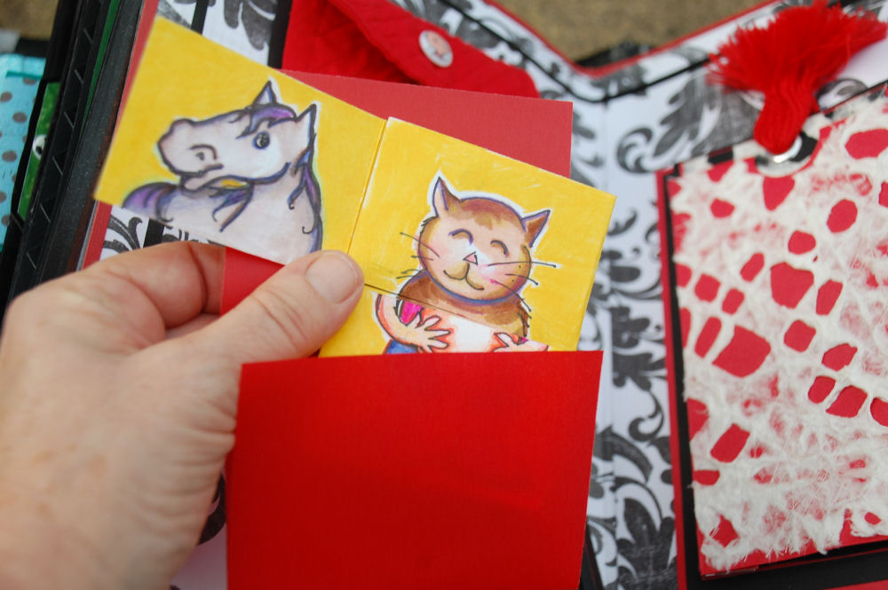
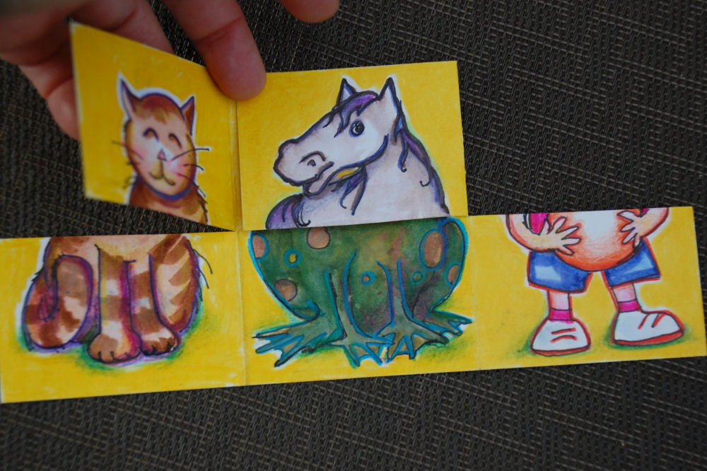
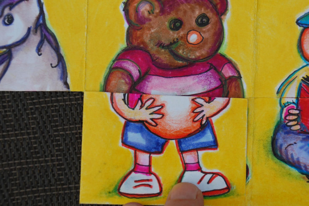
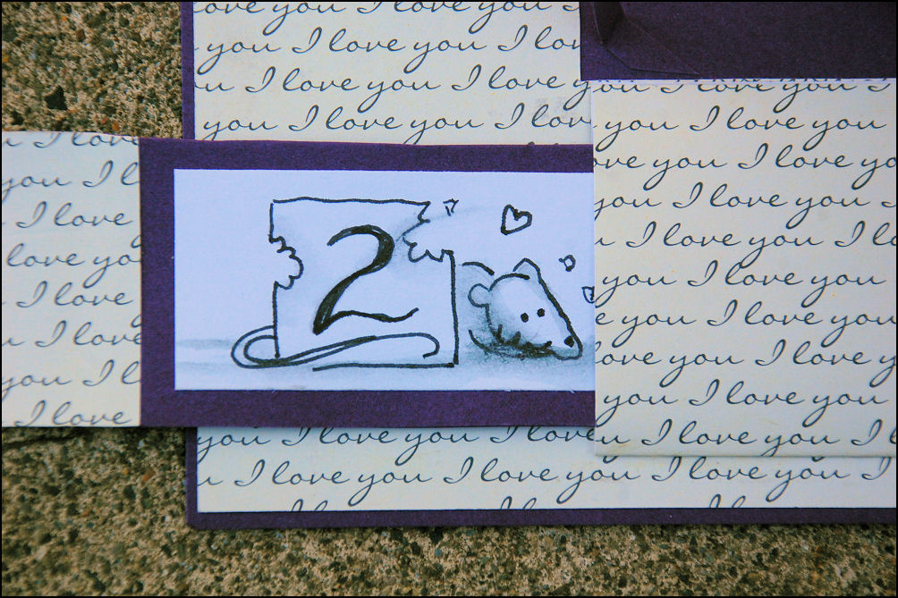
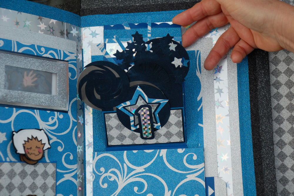
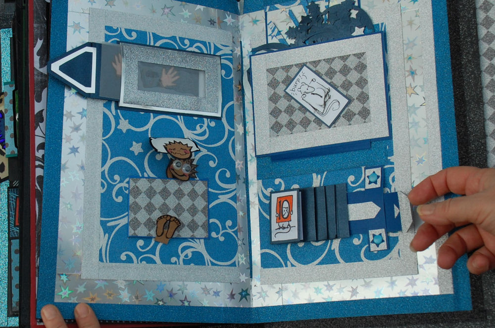
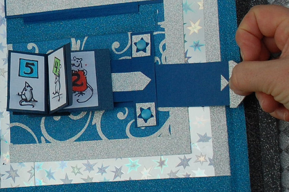
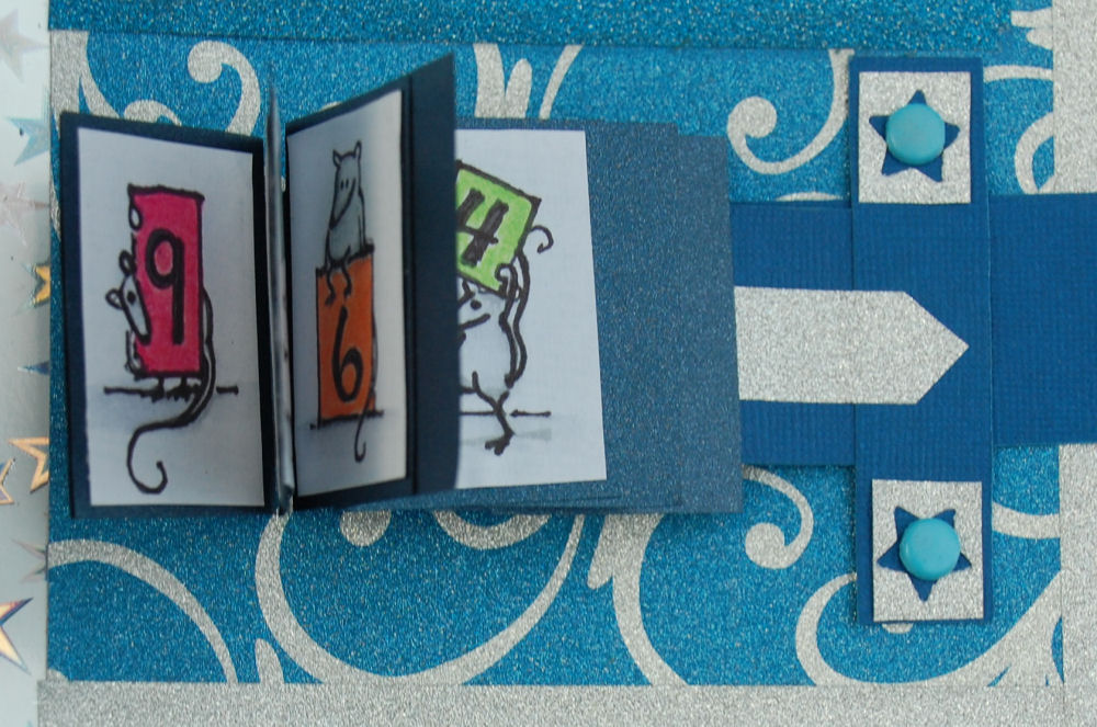
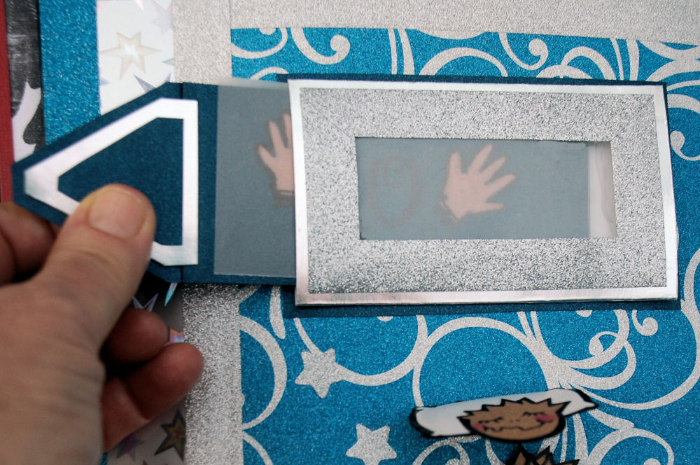
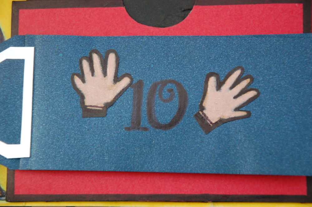
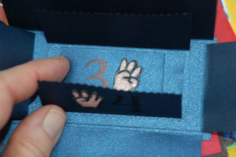
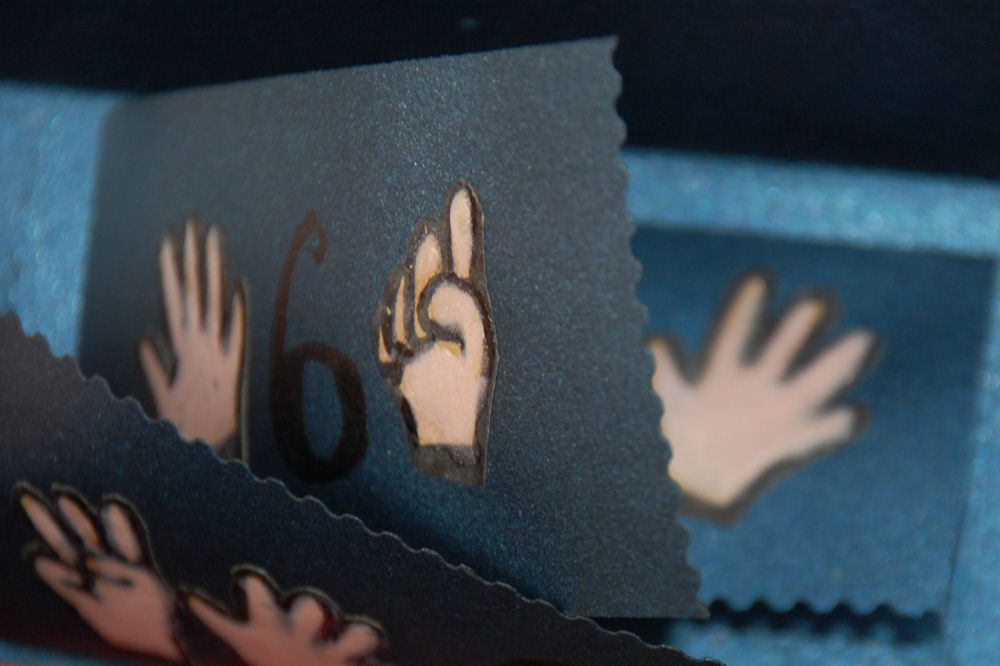
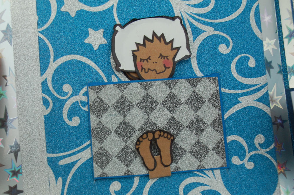
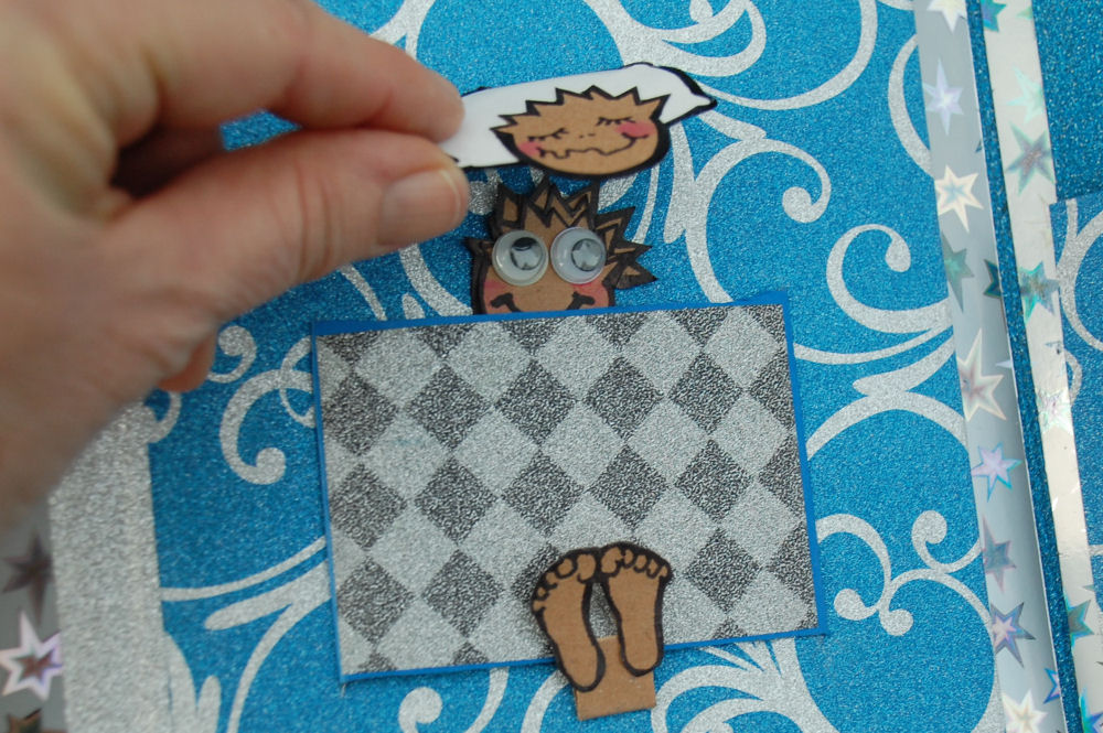
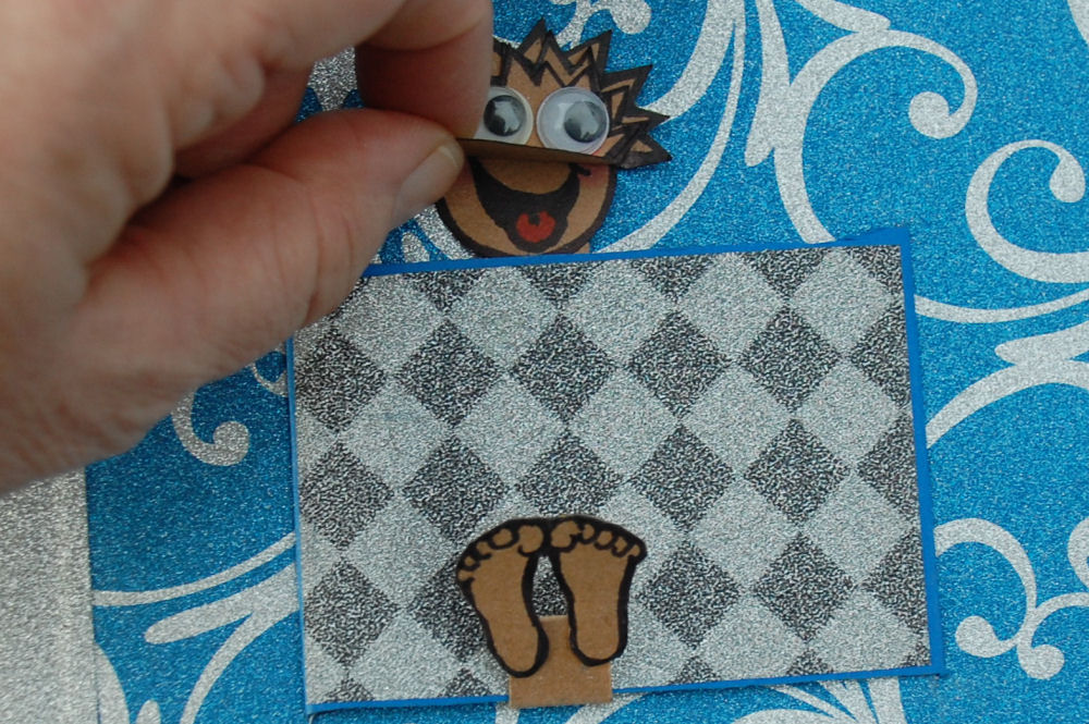
There is a title cover page, then a page is made for each separate word in the title, ‘Cameron’, Can’, and ‘Count Backwards’… three extra pages because I absolutely had to make that can! Throughout there are interactive components, and on each page a mouse is hidden somewhere. It took so long to perfect each page, by the time the last pages were under construction the first ones already seemed amateur and needed to be re-done, either by disassembling parts or completely starting over. A person could forever be perfecting one book, but it’s time to finish this one and start the next for Cameron’s fourth birthday.
 |
 |
 |
 |
 |
|
 |
 |
 |
 |
 |
|
 |
 |
 |
 |
 |
|
 |
 |
 |
 |
 |
|
 |
 |
 |
 |
 |
|
 |
 |
 |
 |
 |
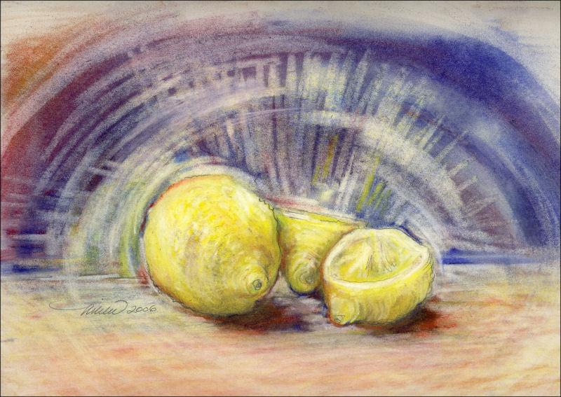
New Mexico Sunset
Saturday, February 7th, 2015

New Mexico Sunset, 11H x 14W inches oil pastels on paper, white mat. An extreme departure in style, but sometimes the impression of the experience calls for it.
Cameron Can Count
Saturday, April 19th, 2014
April 2014: Cameron Can Count to 30
8 x 8 inches markers, watercolors and fixative on canvas. Thinking that acrylics paint would make pages stick together even when dry, I chose watercolors on primed canvas instead, barely diluting the paint so the colors are dense. Krylon workable fixative works best to protect the work, as it brings out the colors very nicely and it doesn’t hold the caustic smell that regular varnish does.
 |
 |
 |
 |
 |
|
 |
 |
 |
 |
 |
|
 |
 |
 |
 |
 |
Each page has a hole peeking through to the next page and the one before, where colors match up in such a way that the hole may only be noticed when the page is turned. The holes were filled in for the sake of aesthetics in the images shown here. This peek-hole detail was an afterthought, and since I had already painted most of the pages I was committed to using certain colors, which made the process take longer than it had to. When using this idea next time, the peek-holes will be larger and be the main focus of the book. Large binder rings through grommets on each page hold the book together, so the pages are fairly easy to turn and the book can start anywhere.
 |
 |
 |
 |
 |
|
 |
 |
 |
 |
 |
|
 |
 |
 |
 |
 |
Hydrangea
Tuesday, August 6th, 2013

Blue Hydrangea, 18H x 24W inches graphite on 80 lb premium, white mat
Blue Flag Iris
Tuesday, July 30th, 2013

Blue Flag Iris, 24H x 18W inches graphite on paper, white mat
Gladiolas
Tuesday, July 2nd, 2013

Gladiolas, 24H x 18W inches graphite on paper, white mat
Blue Flag Iris Abstract
Thursday, May 9th, 2013

Blue Flag Iris Abstract, 10 x 10 x 1 inches oil pastels on canvas, unframed.
Spring Garden Mix
Saturday, April 27th, 2013

Spring Garden Mix, 18H x 24 inches oil pastels on 80 lb acid free premium. Framed size 27H x 33 inches.
BlossoMania
Thursday, April 25th, 2013

Blossomania, 12H x 16W inches oil pastels painted with oil blending and glazing medium on 80 lb acid free premium, white mat
I’ve been admiring the round masses clumped on the Plum tree branches in our neighbor’s back yard for a week or so now. Yesterday and today, pink swirls in the wind inspired this kooky poem
 Petals are falling, the sky is blue
They cover everything, old and new
If I sit too long, I’ll be covered too!
Larger image shows the finished piece, 12H x 16W inches, which was cropped from the original size, left thumbnail, 18H x 24 inches. Blogging always reveals a different perspective. If I had not re-sized the original in order to post, I might never have recognized that the cropped portion has a more balanced composition…benefits of blogging!
Celosia – work in progress
Thursday, April 18th, 2013

Celosia, work still in progress, 18H x 24W inches 0il pastels on 100% cotton paper
This piece was tucked away a month ago, planning to continue work in future with new eyes, so with nothing to lose, I jumped back in today and threw more color around. I splurged today and bought about 40 new oil sticks, the “Sennelier” brand. Wow, they are so intensely colorful and creamy-beautiful to work with! There is no contest as far as quality compared to any of the other brands I’ve been using, but they do have a lot of oil content which makes them muddy easily. Looks like it needs to be stored away again to re-work and refineanother day. I don’t like giving up on a piece until it feels absolutely done, or without a doubt done to death!

Left, March 22nd, 2013, Day 4 in progress
Reminiscent of retro sofa fabric, now that I see it on-screen! Usually leaving page space showing through to create light and brightness, this time I colored the entire page yellow before starting. Adding white did not help brighten areas much, but did muddle colors, helping some flowers recede. Much of the pure color as seen in the early versions has been covered up or removed, but will be re-added cautiously. The style has also gradually changed to more of a Representational/Impressionistic one. To finish, there will be more scrutiny, and fewer emotional responses before adding or removing anything else.


March 20th through 22nd; Days 1, 2, and 3
« Previous Entries Next Entries »