Archive for September, 2006
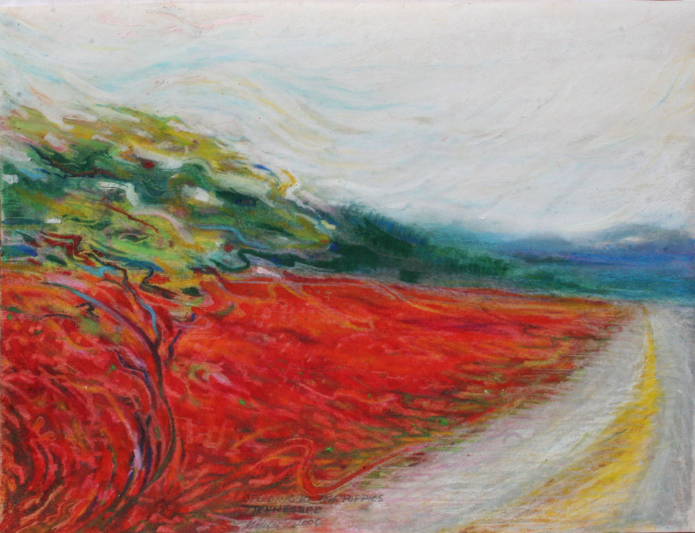
Speeding by the Poppies
Saturday, September 30th, 2006
Speeding by the Poppies, Hwy 40 Tennessee USA, 14H x 11W inches oil pastels on paper with 3-inch-wide white double mat and 26H x 22W inch white custom-built white wood frame with crackle finish.
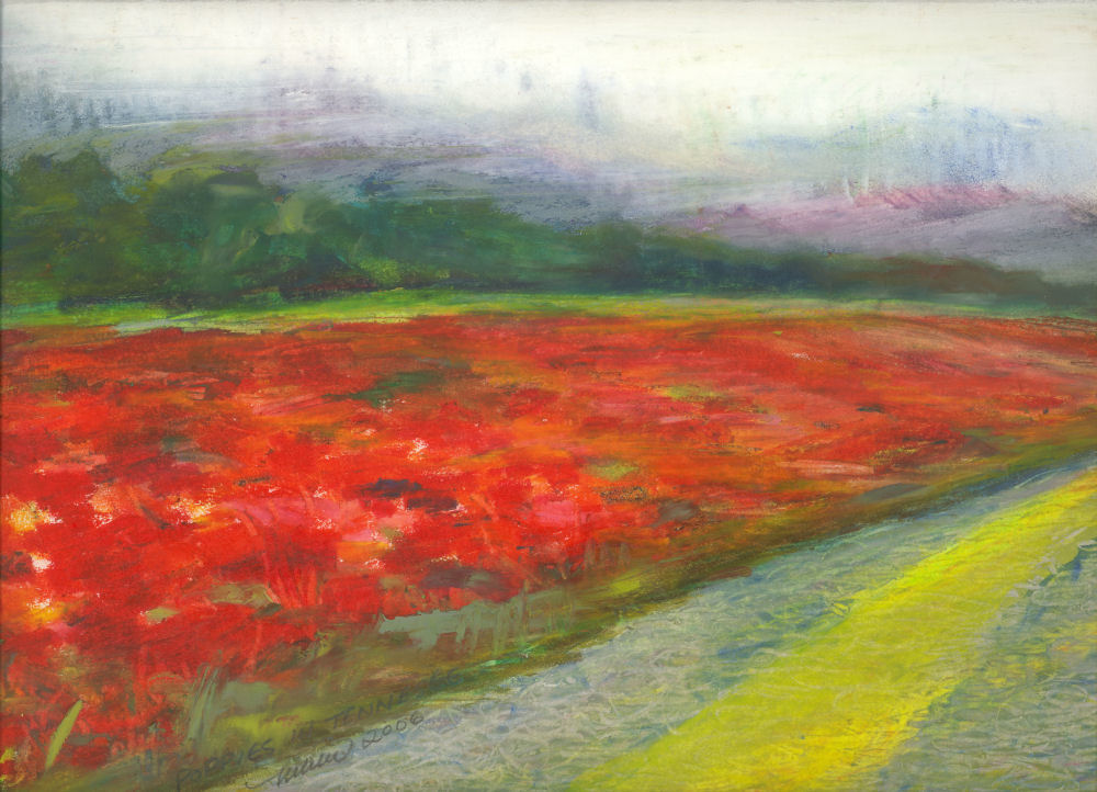
Tennessee Poppies
Thursday, September 28th, 2006
Tennessee Poppies along Hwy 40 Tennessee, 11H x 14W inches oil pastels on paper, 3 inch white double mat and 26H x 22W inch white wood frame with crackle finish. Sold.
Moon Over Cypress
Wednesday, September 27th, 2006
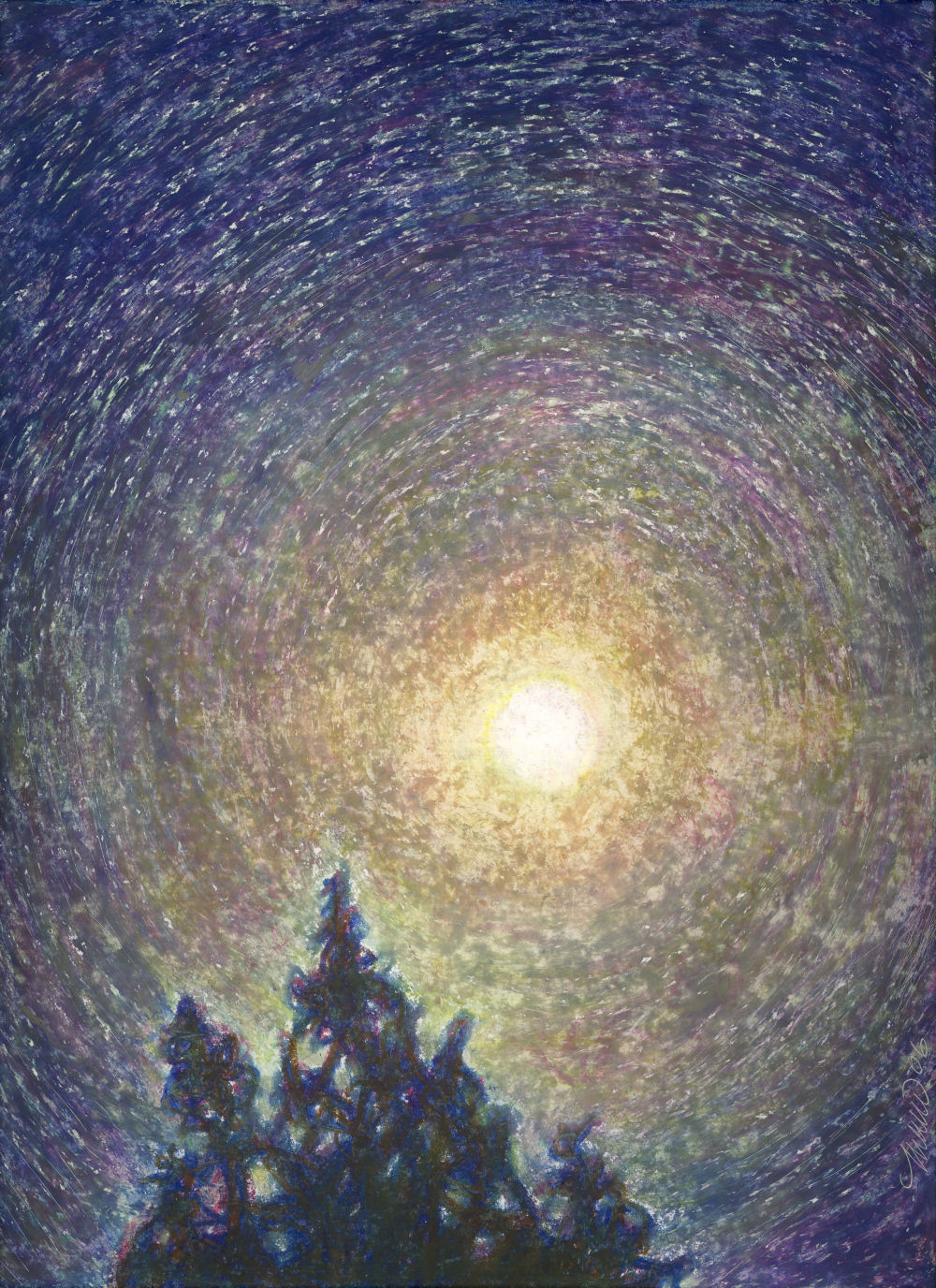
Moon Over Cypress, 14H x 11W inches oil pastels on paper, framed with 3-inch white double mat and 26H x 22W inches white wood frame with crackle finish.
This turned out differently than what I originally envisioned — it’s much better because the paper shows through like stars and reminds me of time lapse photography. It is a rare piece in this series that came together quickly and will not be reworked.
Post dated note: accepted into Studio 2600’s Holiday Light and Sparkle Exhibition Nov. 2007-Jan. 2008. Now sold.
Moon Over Myrtle finished
Tuesday, September 26th, 2006
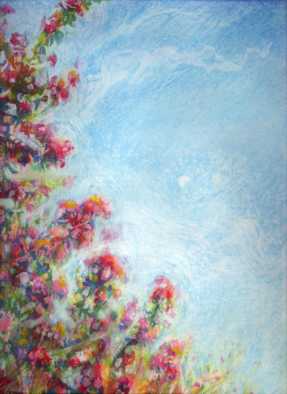
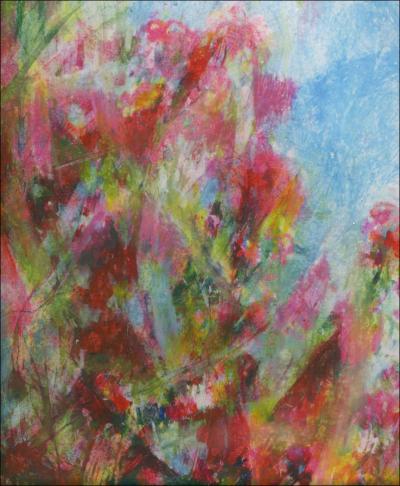
Moon Over Myrtle, morning moon over Crepe Myrtle tree, Lewisville, Texas, 14H x 11W inches oil pastels on paper with 3-inch-wide white double mat and 26H x 22W inch white custom-built white wood frame with crackle finish.
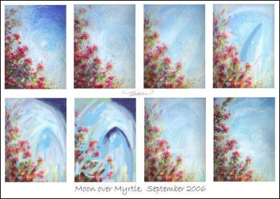
This is another oil pastel drawing that went through a few transformations while posting on a popular interactive artist’s website, wetcanvas.com. It was noted after posting this stage that the sky looked more like water, so I played around with ideas that might make it look less so using computer alterations first, a new tool for me, then altering the drawing itself.
Moon Over Myrtle, stages
Sunday, September 24th, 2006
Work in progress online with other artist’s comment exchanges.. While trying to change the look of water where sky was intended, at one point it looked like there was a shark shape, so with the computer I added it for fun. Continually scraping away areas then rebuilding and trying ways to give it more depth, then for some reason Cezanne came to mind so I looked him up to learn more about life and work. I learned more about Cubist ideas by applying them than reading about them years ago.
Jabiru
Friday, September 1st, 2006
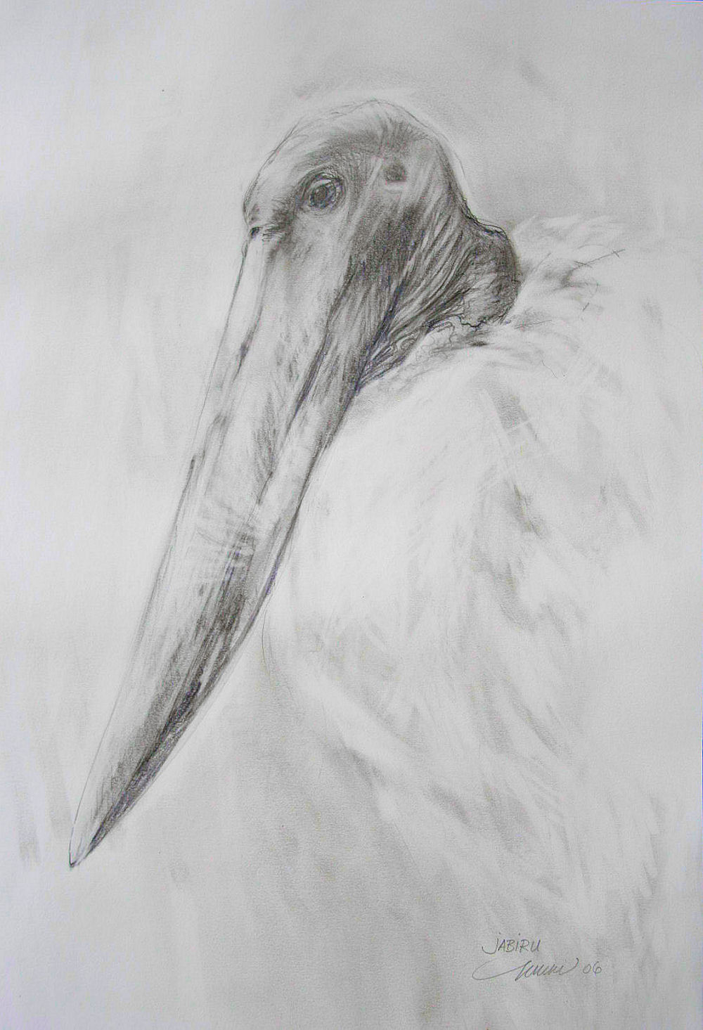
Jabiru at the Dallas World Aquarium, 24H x 18W inches graphite on paper
Post-dated note: Accepted in the J. Mane Gallery’s Fins, Feathers and Fur 2020 exhibition, unfortunately no longer shown in the gallery archives in 2022.
“Drawings have a job to do: to provide viewers with more than just a pretty picture. There are tones implied through those tones!”
Jabiru are large South American prehistoric-looking birds standing 4-5 ft. high. Reference photos for ‘Jabiru’ were taken at the Dallas World Aquarium, where I’ve spent many visits watching a pair of them interact. Fortunately, I can usually study them in silence, because everyone else’s attention is on the flashy coral-colored flamingos just down the aisle.
Before starting I envisioned a drawing based on Japanese principles of using fewer lines and shading, with empty spaces considered as much a part of the drawing as every mark.
This is not the prettiest subject, precisely one of the reasons I chose to keep the drawing soft. By purposely compromising the values and using a lighter touch, my hope was that the viewer’s response might be pleasant before thinking “ugly bird”. To explain further, the Jabiru’s feathers are pure white and its head including beak are very dark grey, almost black. I was stubborn about the style staying gentle and simple, having negative space speak as much.
Whereas a photograph utilizes the whole range of dark and light values, copying everything, a person chooses the amount and quality of dark and light values to apply in order to attain the intended the effect on our emotional impressions.
The Jabiru’s huge beak strikes a strong silhouette by shape alone, so to lessen the impact of the large, odd shape on a fairly empty page, extremes were avoided even though the bird’s beak is quite dark in reality.
I really want stress here that a drawing is not a photograph, and a photograph is not a drawing. Photographs might be the source of inspiration and for details that memory has missed or forgotten. Illustrations that are copied with attempts to produce an exact visual likeness, relying purely on the photo, lack a certain warmth no matter how well rendered they are. Art involves the human factor. A photo is a product of a machine; the visual details are copied with no sense or emotion; it does what it’s been designed to do. Drawings are subjective representations of all that we sense as well as see.
We interpret character of a subject not only visually, but also through our multidimensional senses.


